Since the advent of computers in our studios, we’ve all spent hours looking for the right typeface from thousands of choices, fussed with tiny increments in size, introduced refinements in OpenType fonts containing hundreds of ligatures, alternate characters and content-sensitive positions.
And now “letterpress” is back. Suddenly we’re happy to take a lowercase l and use it for a figure 1 because that particular typeface doesn’t have enough figures? WTF? Wood type sucks when it comes to kerning because you would have to cut away bits of the letter itself in order to achieve “perfect” spacing.
There are no half sizes, let alone fine increments in letterspacing, unless you want to spend hours inserting slivers of brass or thin paper to refine a line of type. The material defines not only how you work but also what the result will look like. If you only have a large wood type font in one size, you run out of certain characters very quickly. So you have to pick a smaller size which will have more of each character or you’ll choose another typeface altogether. If that doesn’t help, you’ll change the message. Making new large type for letterpress printing is really quite stupid then. Why do we bother?
If you are interested in design as a problem solving activity, you thrive under constraints. The typographic system of letters and spaces – horizontal and vertical ones – can be seen as both limiting and liberating. Once you’ve learned how to use the tools and work within the clever, complex but ultimately finite system, you’ll appreciate the limits it sets you. The whole system is one giant grid that can be divided and multiplied in myriad ways. Pages will always look good as long as you work within the constraints, time being one of them. If you spend too much time tweaking the system, things will look mannered and inappropriate. Here, modesty is a virtue.
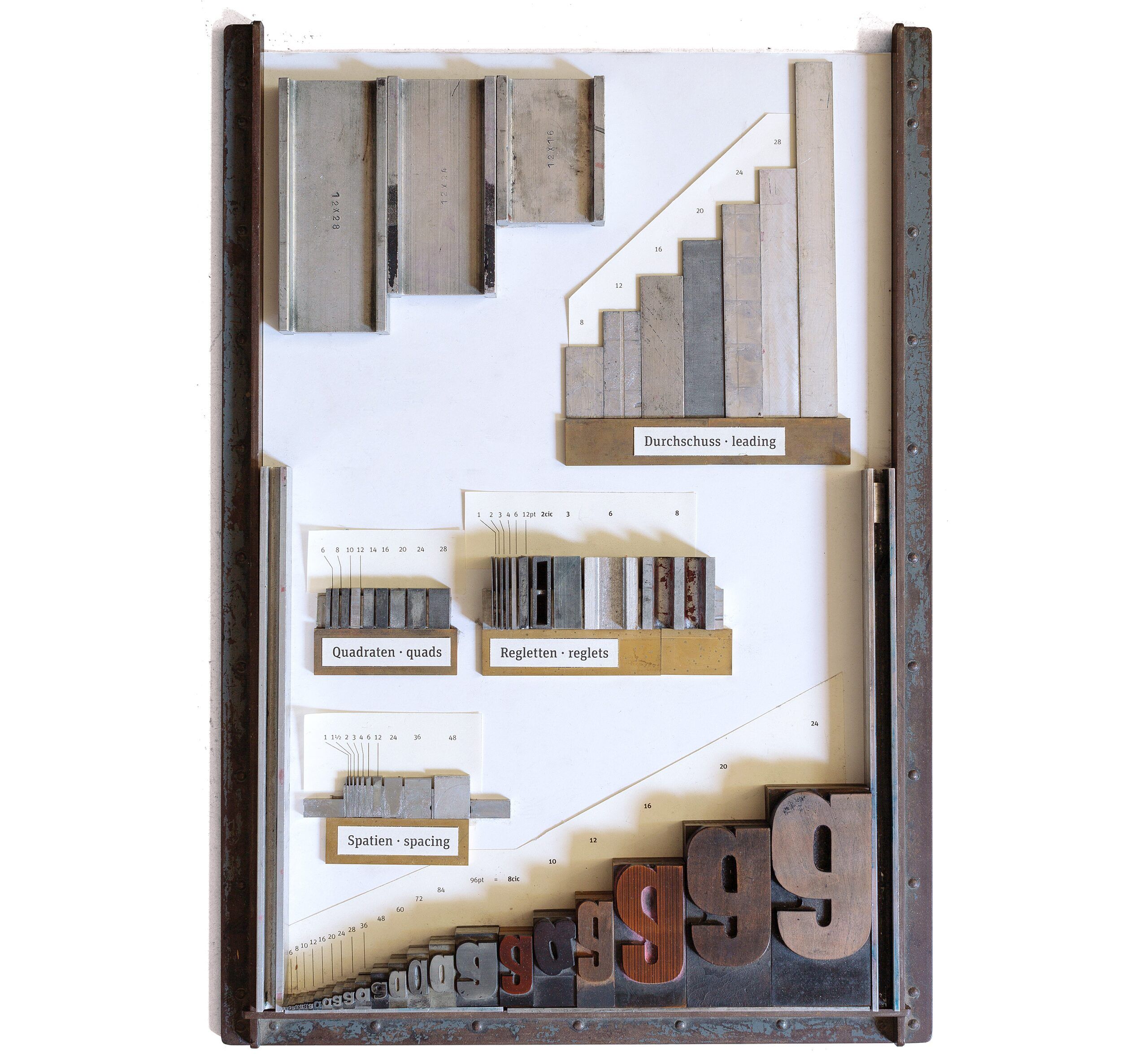
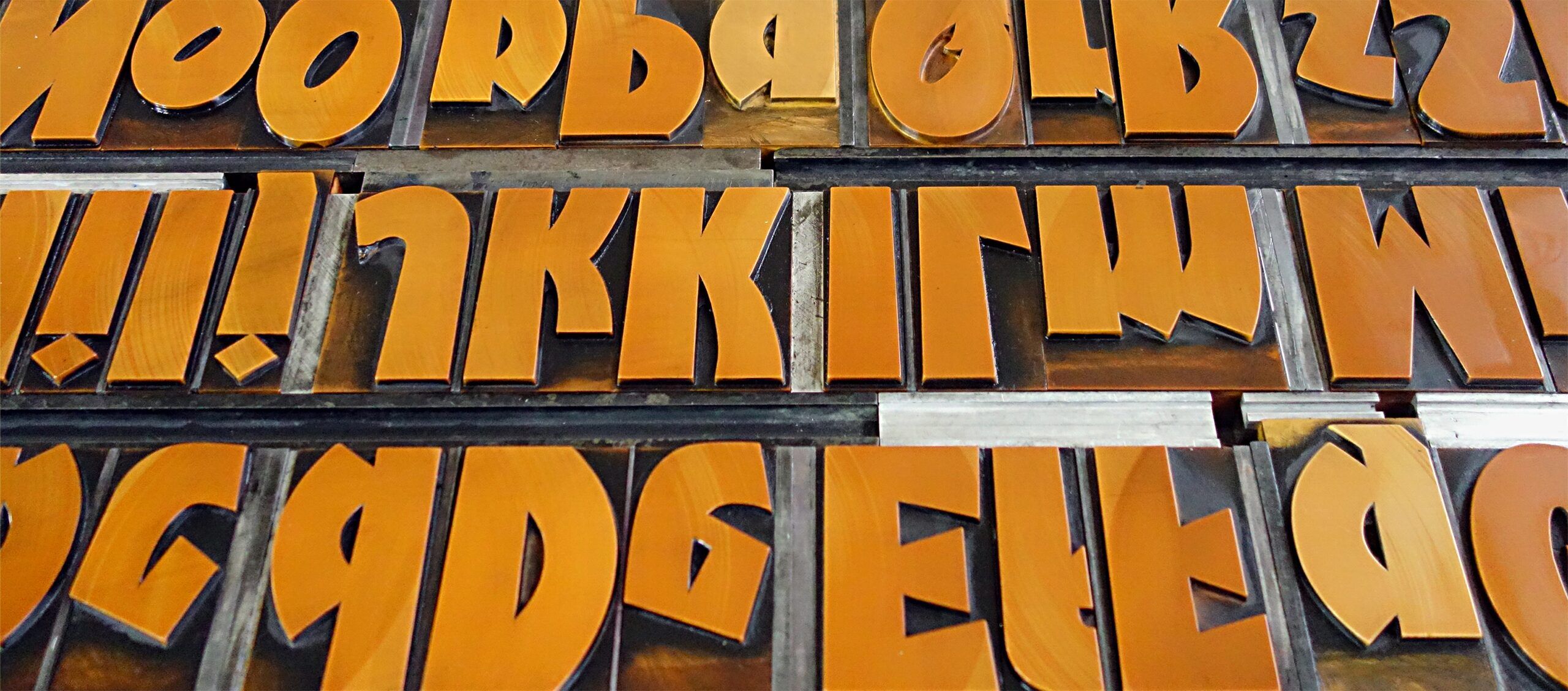
Nobody who has ever held a large piece of wood type has been able to resist the fascination that these objects evoke. There is nothing like setting up a forme (yes, with a silent e at the end) from bits of lead, steel, aluminium, brass and wood – a very messy sight, as these materials have all been around and aged differently – and then running a clean white sheet of paper through the press and over that colourful forme. Suddenly and quite magically, there is a message: words on paper, exactly where you wanted them.
Now then, beyond those philosophical issues here are three practical reasons while we have been making our own large type at p98a:
1. A lot of the more than 800 cases of display type in our workshop (not all of it is made from wood) have characters missing, damaged, not available in sufficient amounts. And, of course, nobody had a need for hashtags, @-signs, €-characters or other recent additions. Fonts from the US or Britain don’t have the umlauts like ä,ö,ü and other accents that languages beyond English require – it being the only language that manages without any diacritical marks. So we need to make new letters to complete or augment the character count.

2. Some of our favorite type is only available in one or two sizes, and often not the one we would like to use. So we need to make other sizes for the same design.
3. There are fantastic new typefaces being designed today that look really good in large sizes. We don’t always want to evoke the old times by using type that was designed more than a hundred years ago. Instead, we want to move letterpress out of the nostalgic niche where is has been sitting since its revival through the application of polymer plates. When we make new digital designs available as large display type, we can decide which characters we want, which size exactly and how many of them.
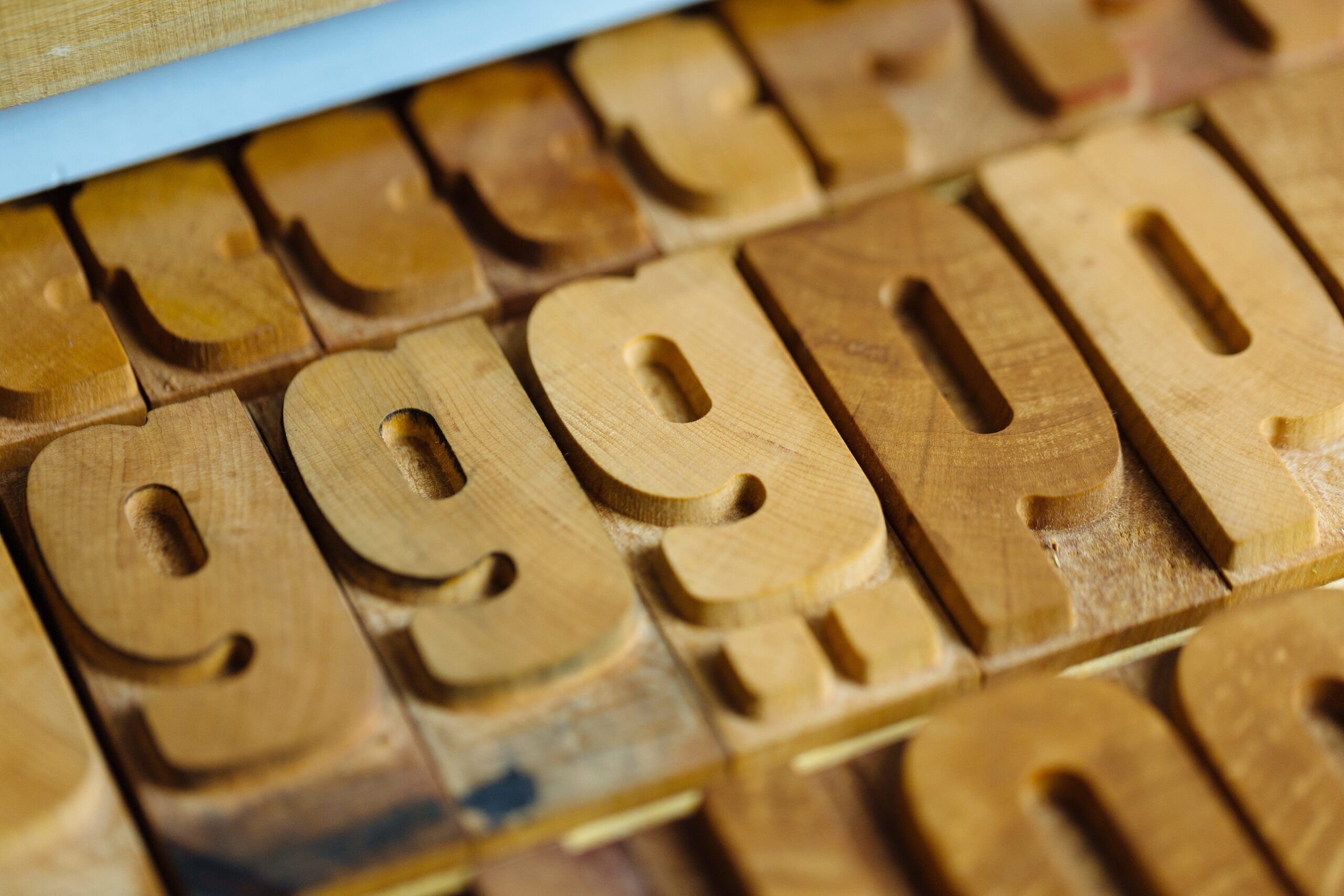
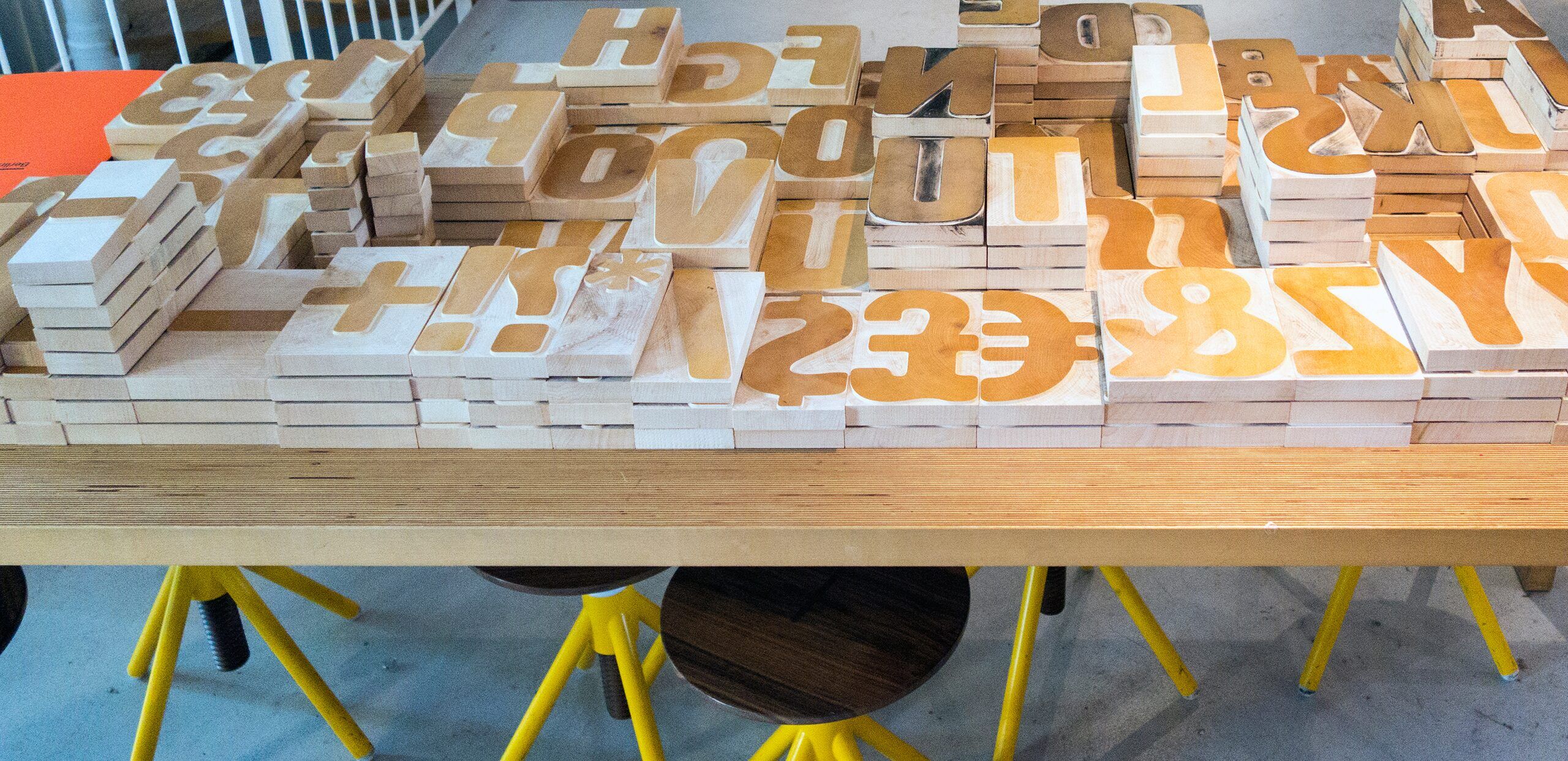
The traditional tool for making wood type is the pantograph. The rotating bit at the tip of it cuts into wood, its movement steered by the other end of the machine tracing a pattern. If you need large sizes, this pattern needs to be larger still, as the pantograph cannot enlarge, only reduce. The pattern can be a fairly thin piece of affordable material like MDF or even hard cardboard. You can cut the patterns using a CNC machine, a laser or a mechanical router. When Hamilton made the Artz fonts for me, they had the templates cut from data I supplied and traced the different sizes from those patterns.
You can also run a CNC router directly from data, with no human interference and thus much higher precision. This is not as easy as it sounds because you need to apply different types of routing bits. We use a 3D router where a thicker cylindrical bit cuts away the outer shapes while a smaller conical bit cuts the counter shapes. As it gets into the sharp corners, the bit is lifted up, cutting only with its very fine tip. This gets such sharp corners inside the counters that the letters don’t need to be trimmed anymore. At Hamilton that work used to be done by specialised “trimmers”, often women who had the delicate touch required.
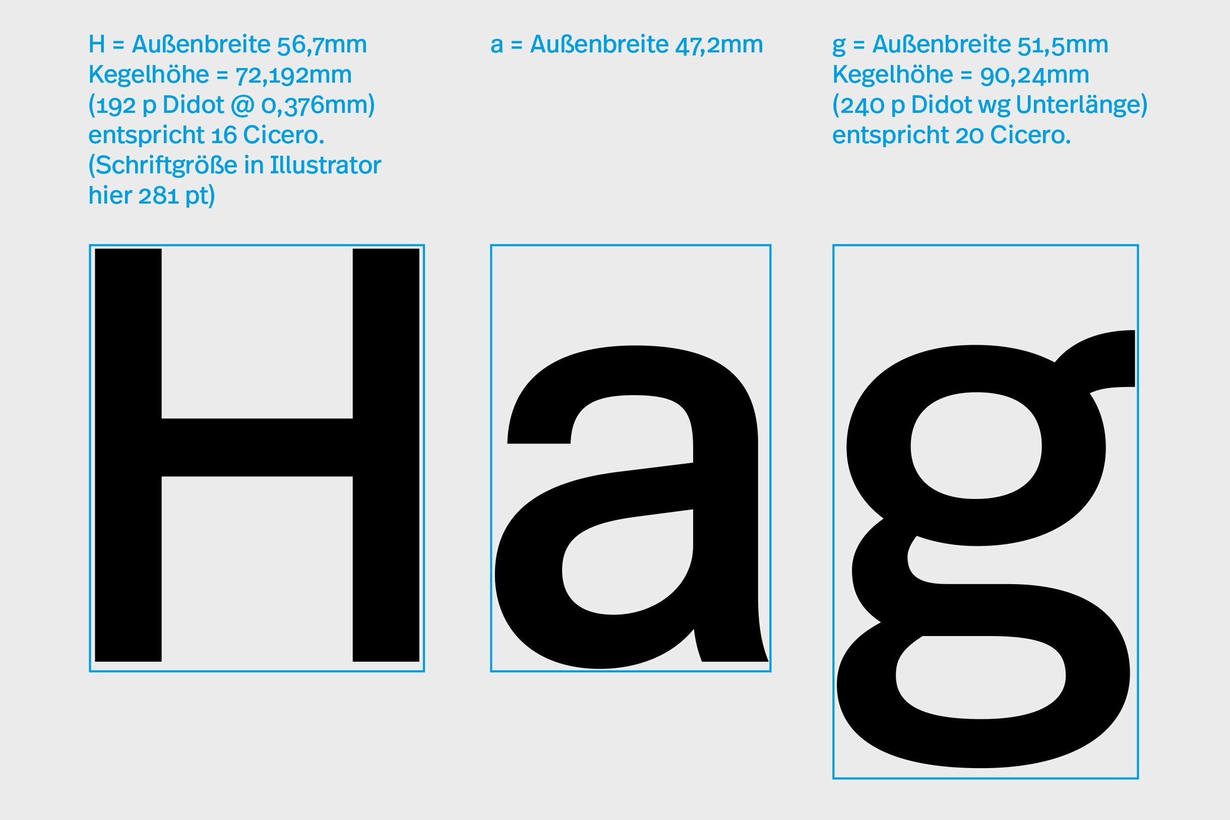
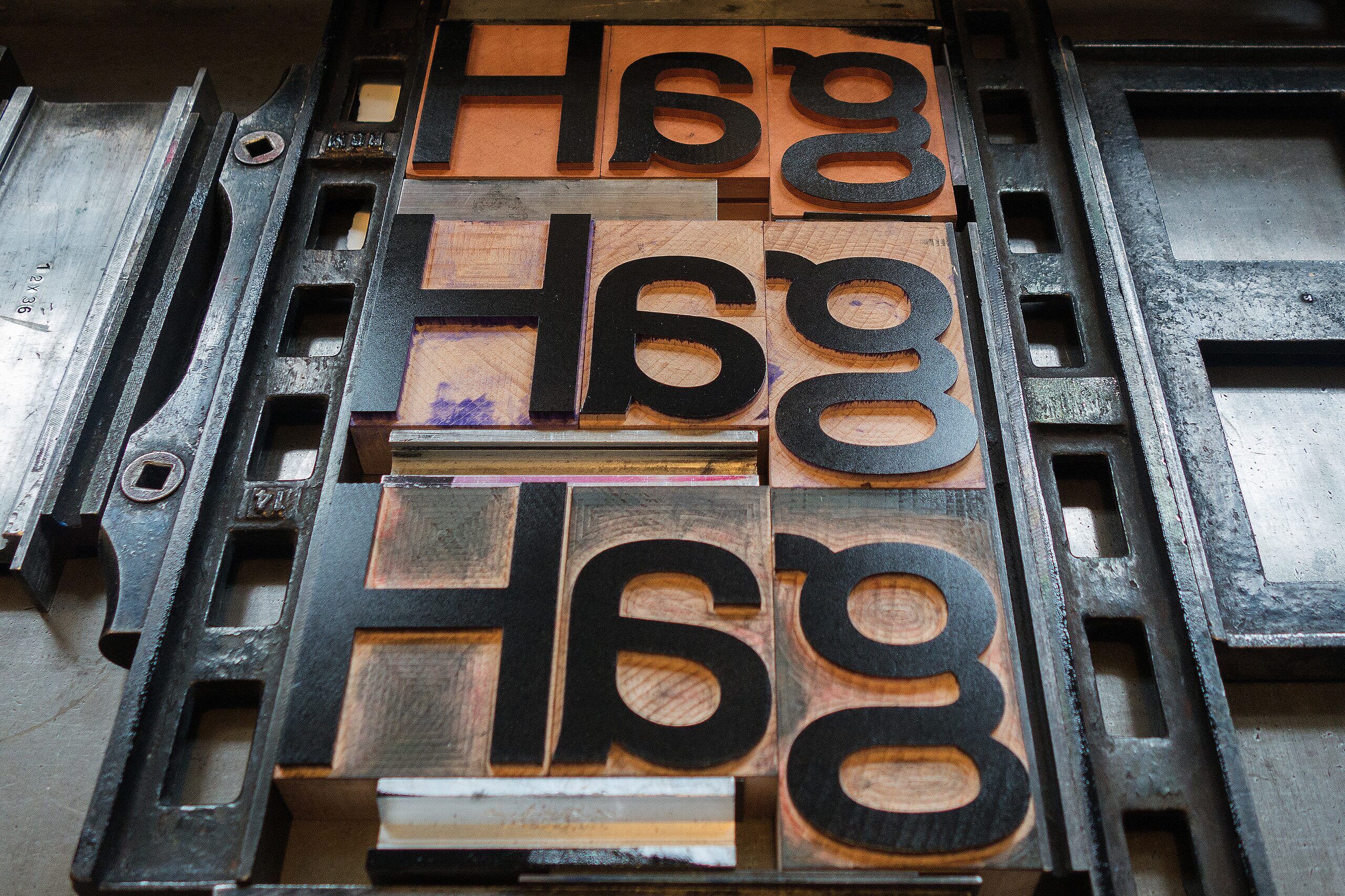
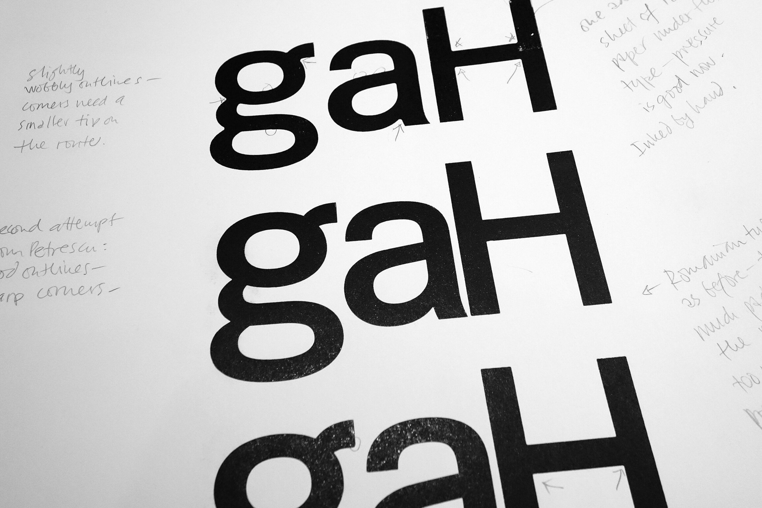
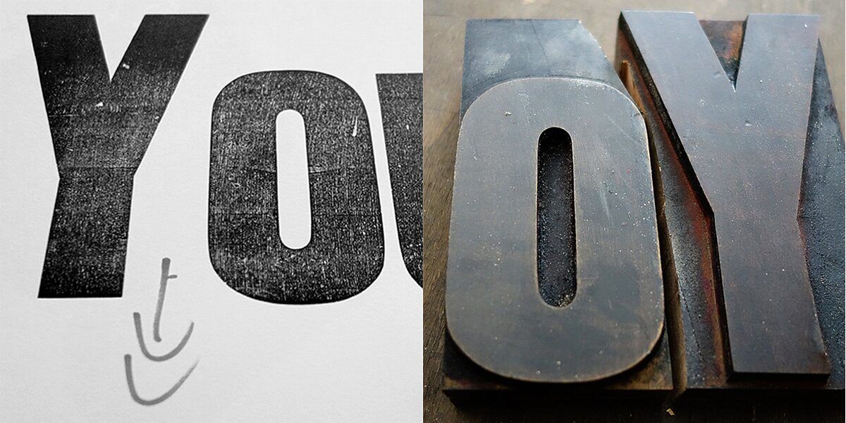
Large type isn’t fitted, i.e. the characters have no widths either side. Instead, they are cut as closely to the contour as possible. Spacing is done by adding reglet or furniture. Kerning – taking out unwanted space between critical combinations like Yo – can only be achieved by physically cutting away pieces of adjacent characters. This leaves permanent damage and is usually avoided.
Tracking all the letters to fit with the worst-case combinations is a healthier method to achieve even spacing. Letters are also cut as close to the baseline as possible. Characters with descenders are deeper than those without and will have to be accommodated by adding extra spacing material next to them. Good fonts will have the descenders take an exact fraction of the main body size: a 16-line (i.e. pica or cicero) face will have 4 lines added, making a g or j 20 lines altogether. For a 12-line face that would be an additional 3 lines, for 20-line an extra 5 lines, etc. Not all foundries used the same system, but we certainly do when we make new type. Composing large formes of wood type is much easier and the forme much more stable when you use large pieces of furniture to fill it. That also makes the work much faster.
Display type not only needs to be cut to exact sizes within whatever system used (Pica or Didot), the letters also have to be square or they won’t fit together into neat and robust lines. Using type from different systems can be done, but composing a mixed forme is hard work and will always look messy. The type height (not the size!) also differs between Pica and Didot: the Angloamerican height is 23.33mm (or .918”), Didot is 23.56mm. The difference can either be made up by adding paper or card under the type in the press or – better still - by using presses with adjustable beds. Old and thus worn type usually needs to be adjusted anyway and if you use calibrated paper, as we do, this does not present a major problem.
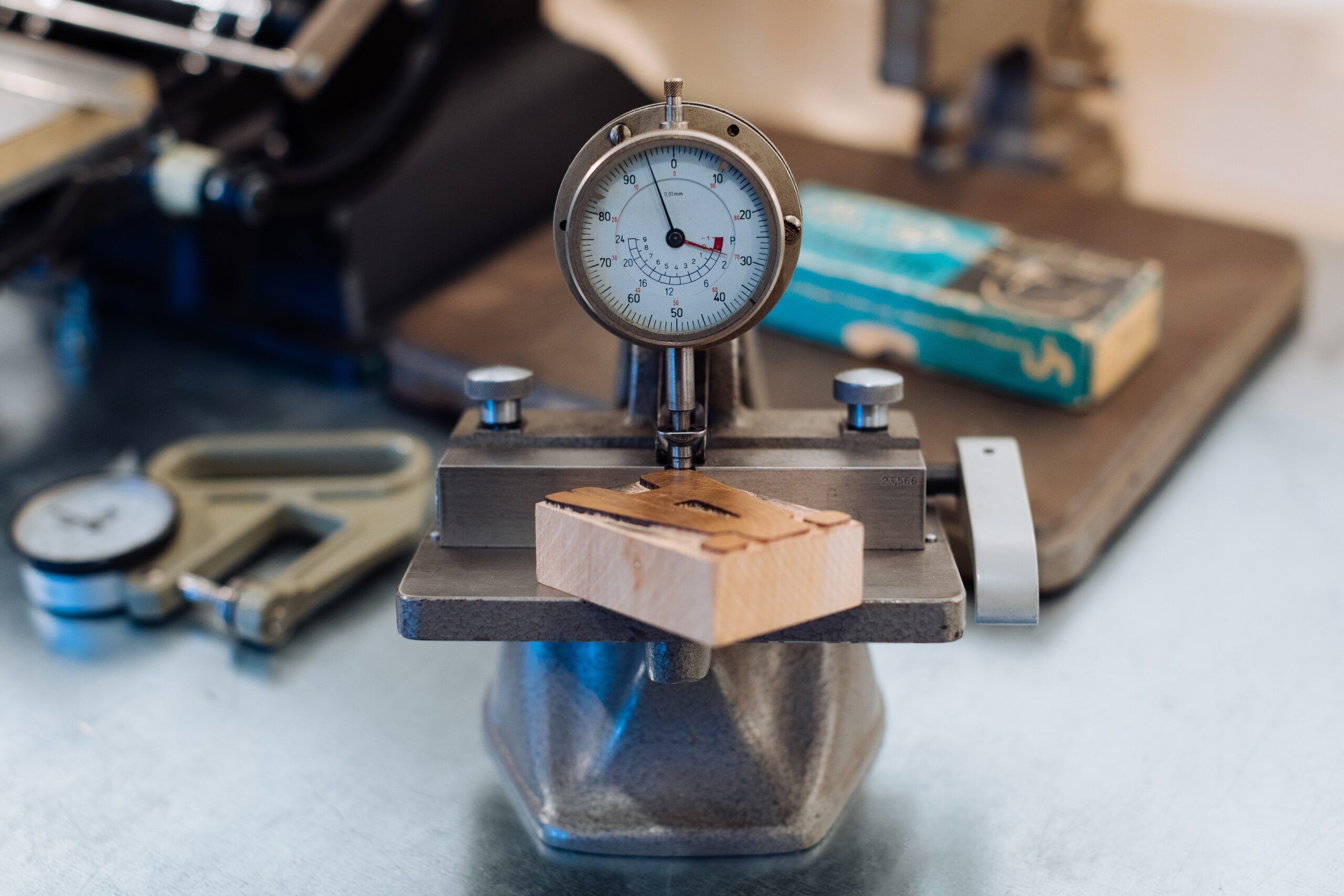
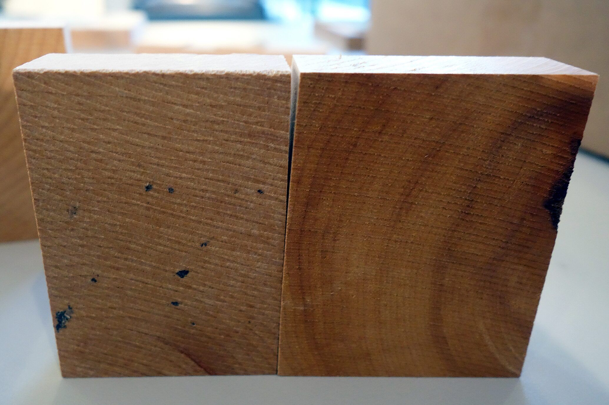
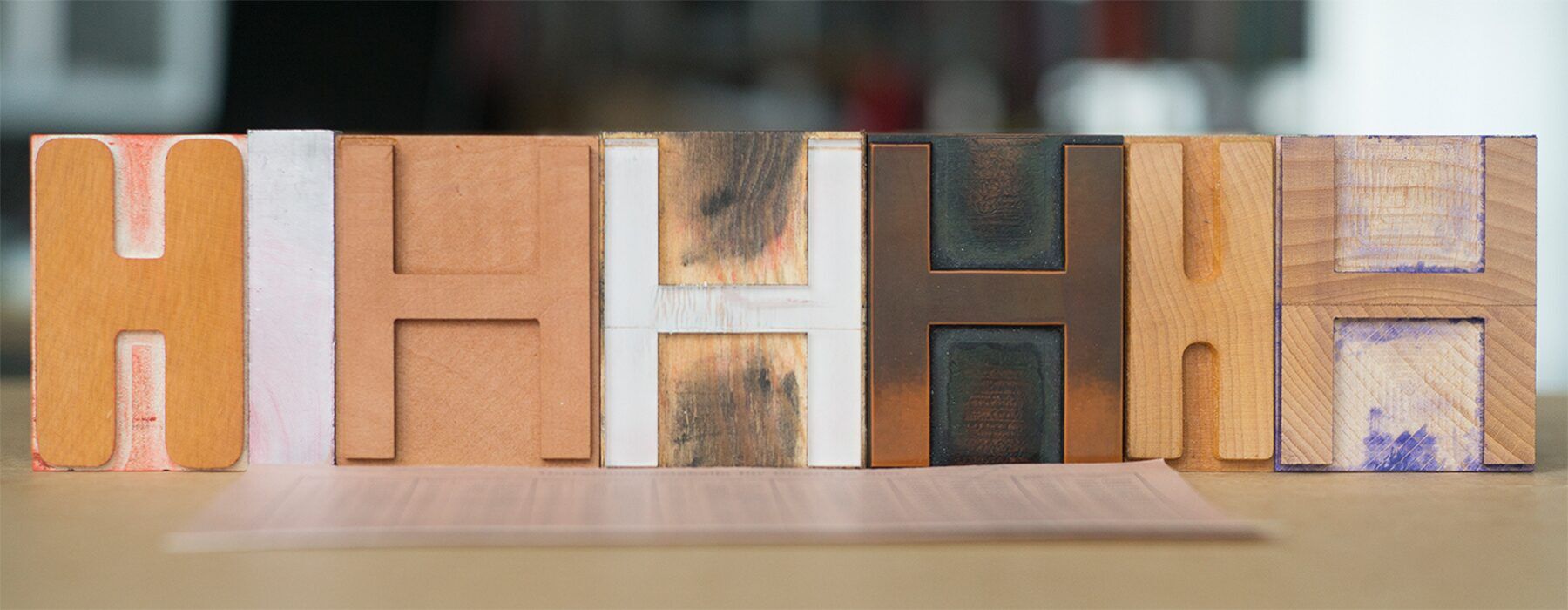
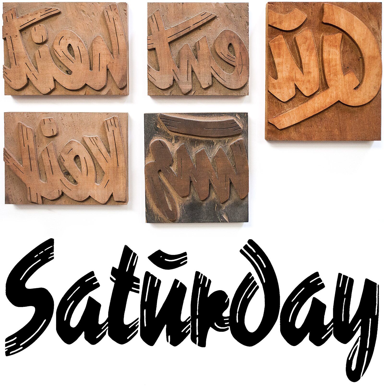
The harder the wood, the more precise but also difficult to cut it becomes. MDF is cheap and works, but not as well as Maple or similar wood. It needs to be aged so won’t warp in use. We have some letters cut from pear wood, which is not only hard but also quite beautiful to behold. Pear trees, unfortunately, don’t grow to the same size as Maples do, making it much harder (!) to get big enough pieces for large wood type.
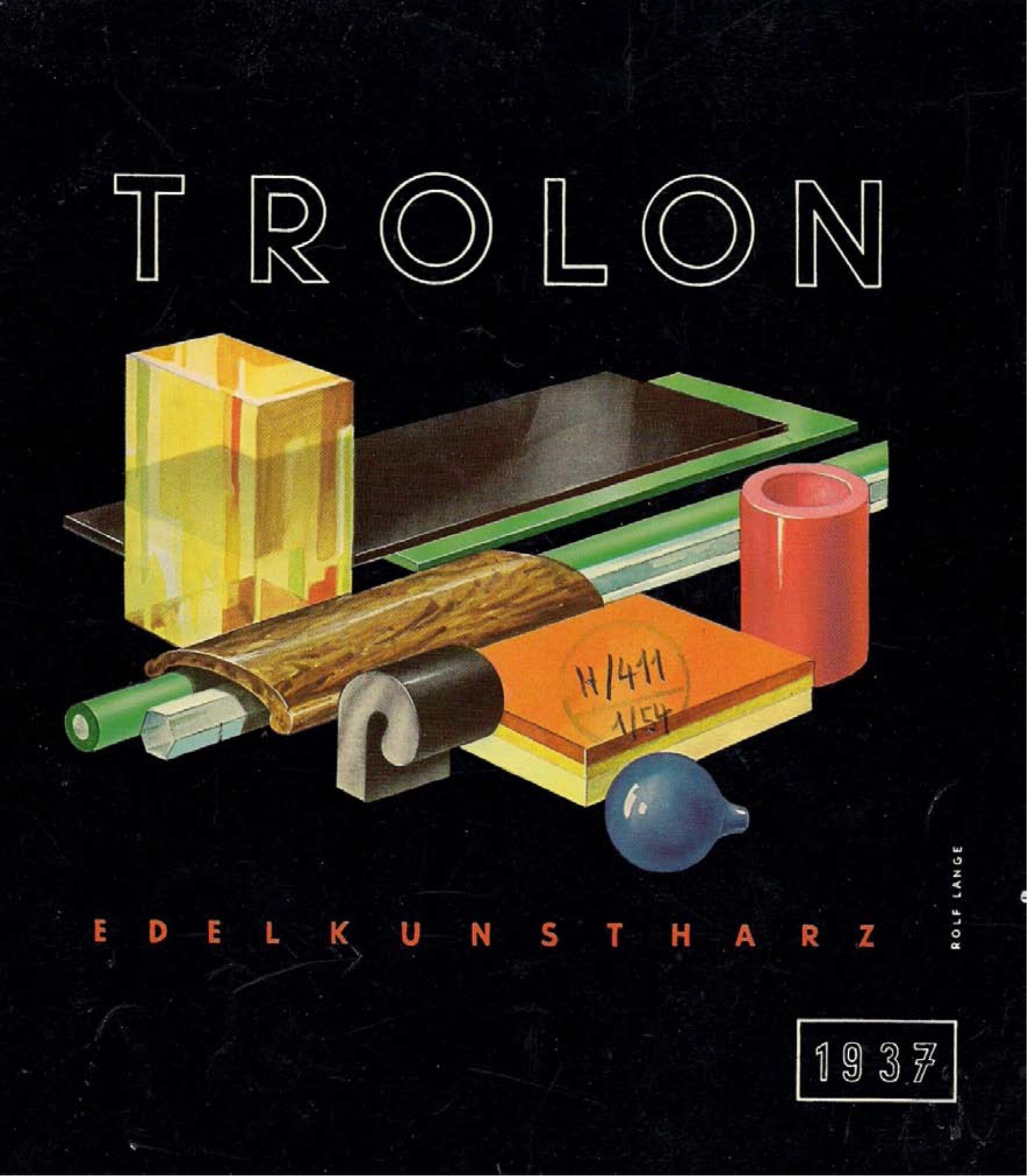
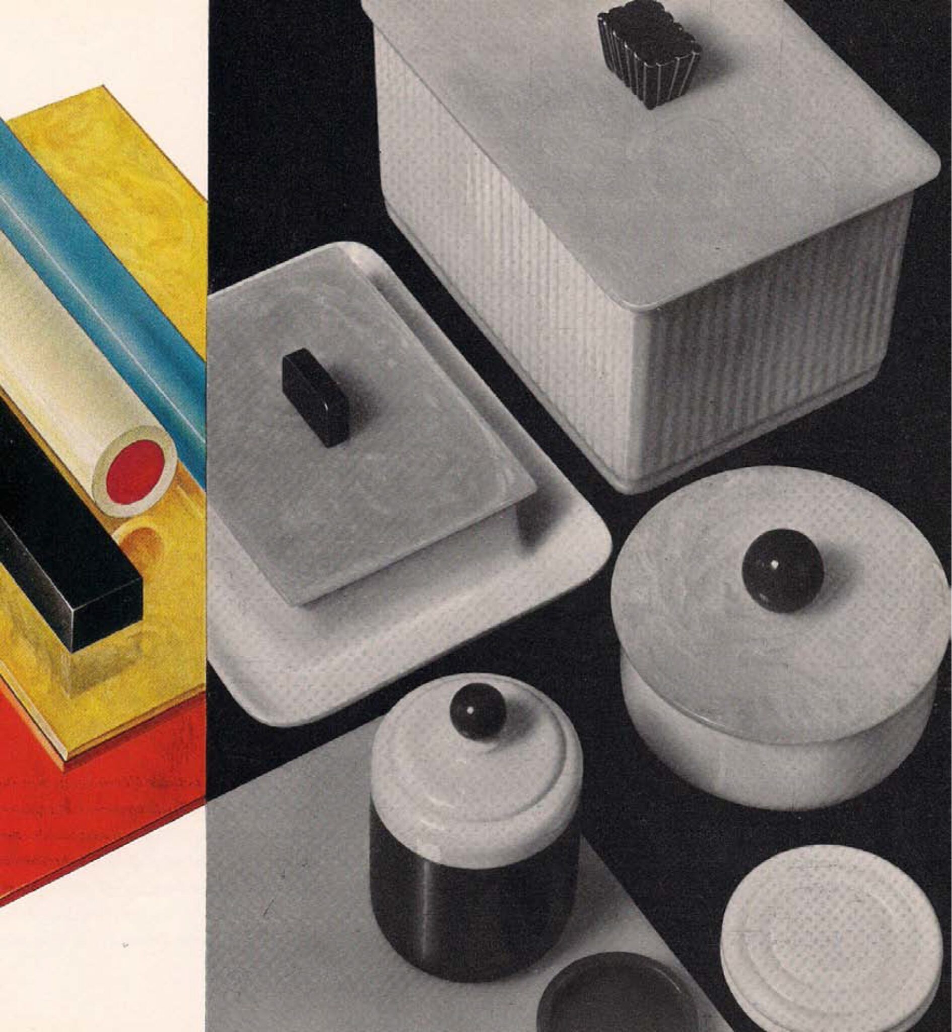
Berthold, the Berlin foundry that cut famous faces like Akzidenz Grotesk and Block, once staple display types in most German shops, patented a material called Plakadur. It was a resin, made by Dynamit Nobel who called it Trolon. That material was originally developed to produce ashtrays, jewellery and other trinkets for the modern household of the 1930s. It is more durable than wood, will yield very sharp contours but is somewhat brittle and will chip easily when not handled carefully.
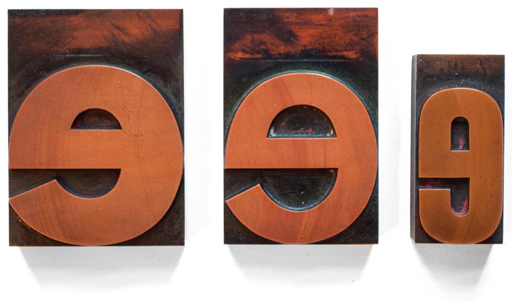
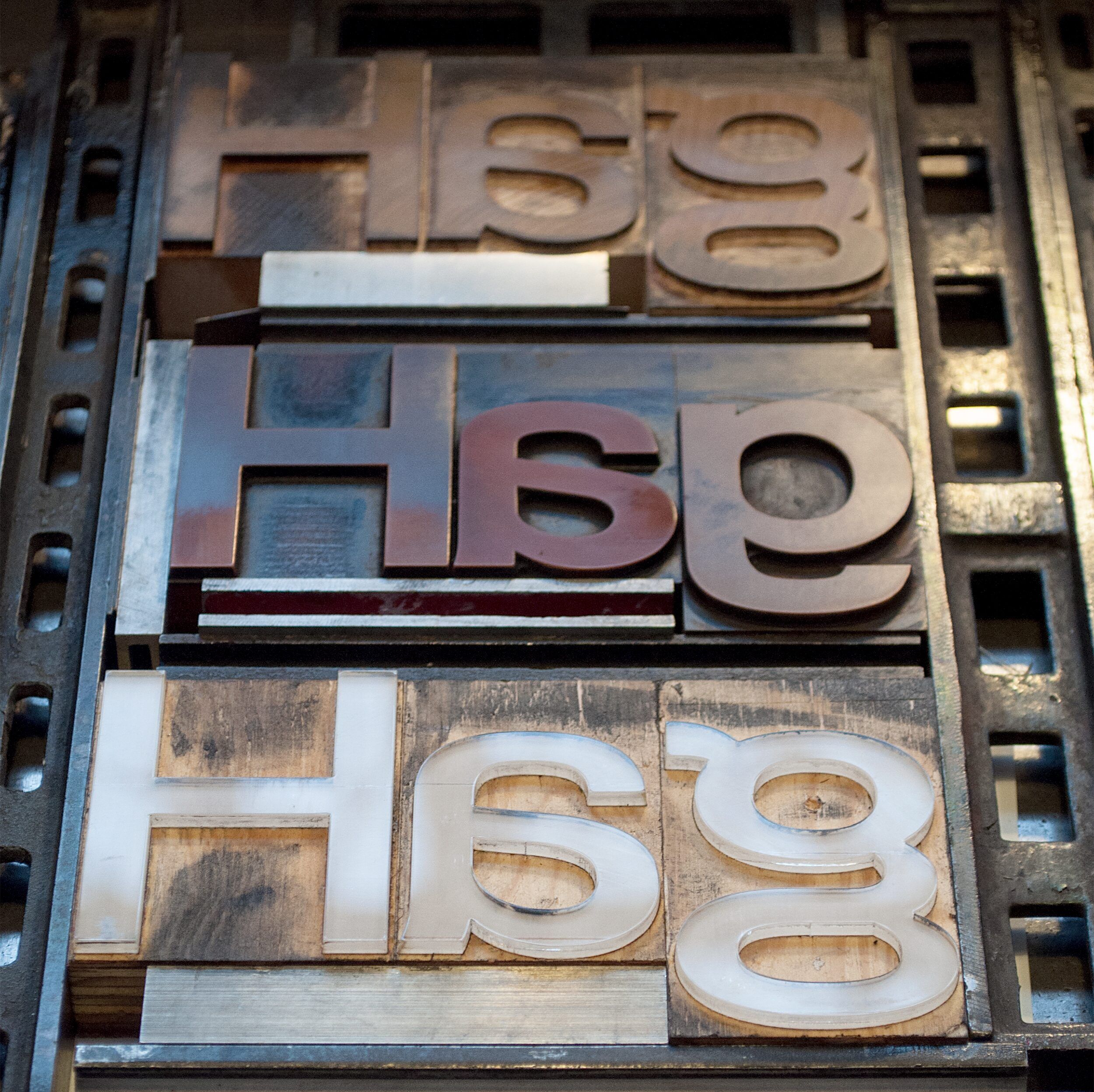
Letters have also been cut from acrylic, aluminium, even glass and all sorts of plastic. At p98a, we are experimenting with 3D-printing, using a resin similar to the original Trolon. This works well, but for now the material is prohibitely expensive. We’re also printing letters with cheaper plastic, using a honeycombe structure inside the letter to make it strong while saving material. Getting all the measurements right with a 3D-printer is not a problem, but achieving a surface that is smooth and will hold ink has turned out not to be child’s play.
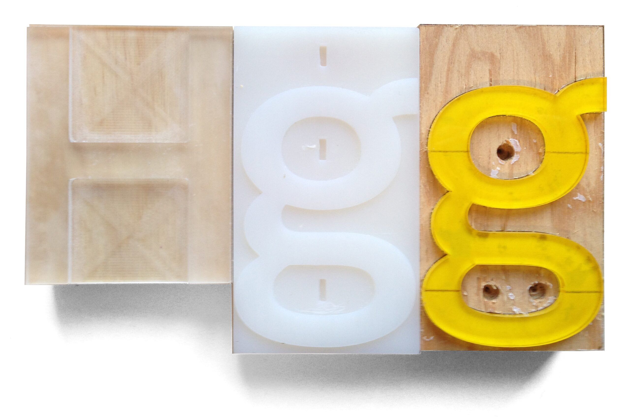
You can even vacuum-form letters once you have one as a same-size model to make a cast from. A messy process but good for making additional sorts for a type you already own.
When we need additional characters or have to add missing ones, we find a digital source for a drawing, adapt the outlines to exactly match our existing size and weight and then submit the data to the CNC router. The surface of wooden letters needs to be varnished, normally using Shellac. This seals the surface of the wood, preventing the grain showing through when printing. Over time that varnish wears off and letters will show a structure. Many digital typefaces want to emulate this rough effect, trying to look like “Olde Wood Type”.
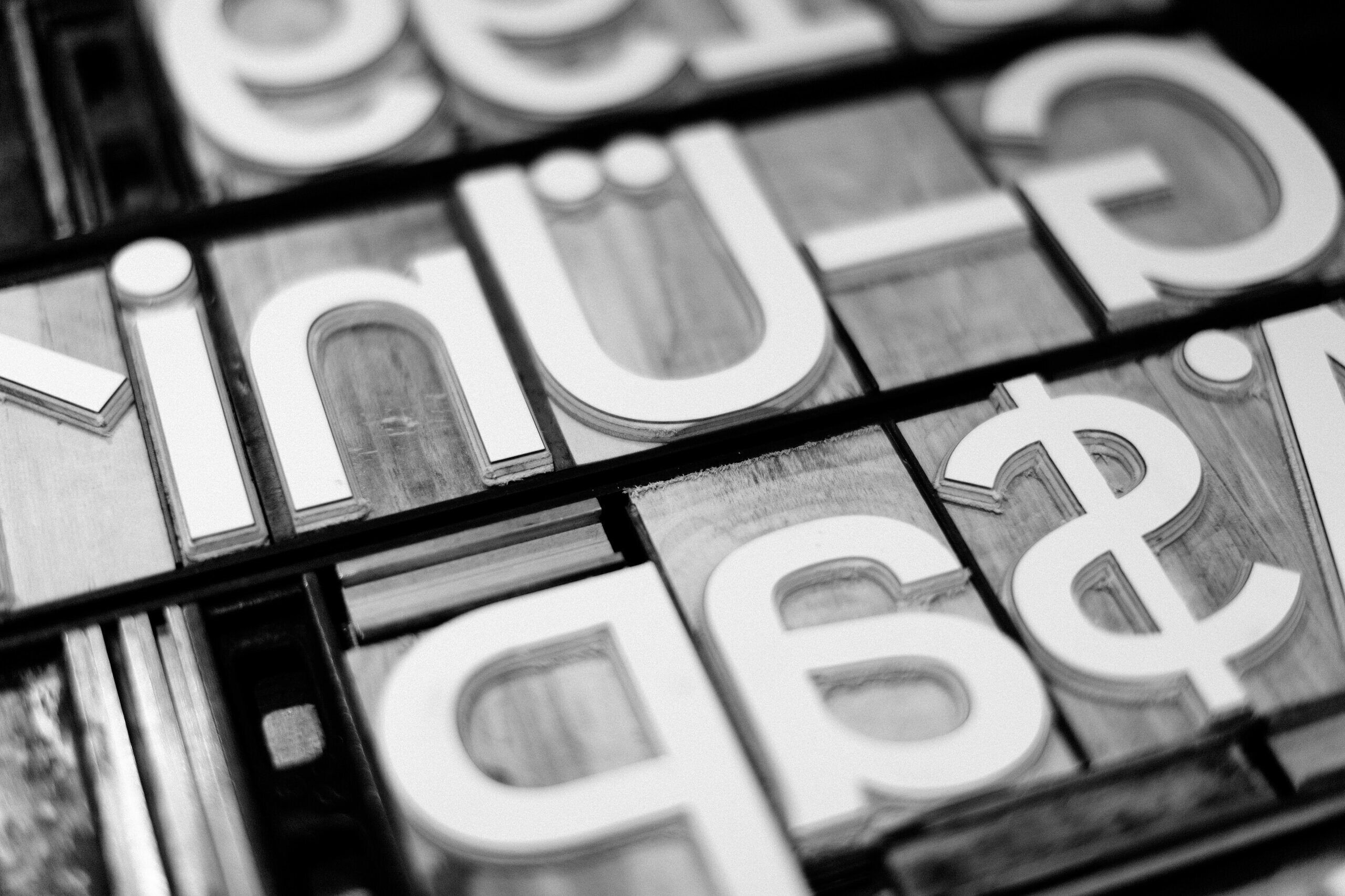
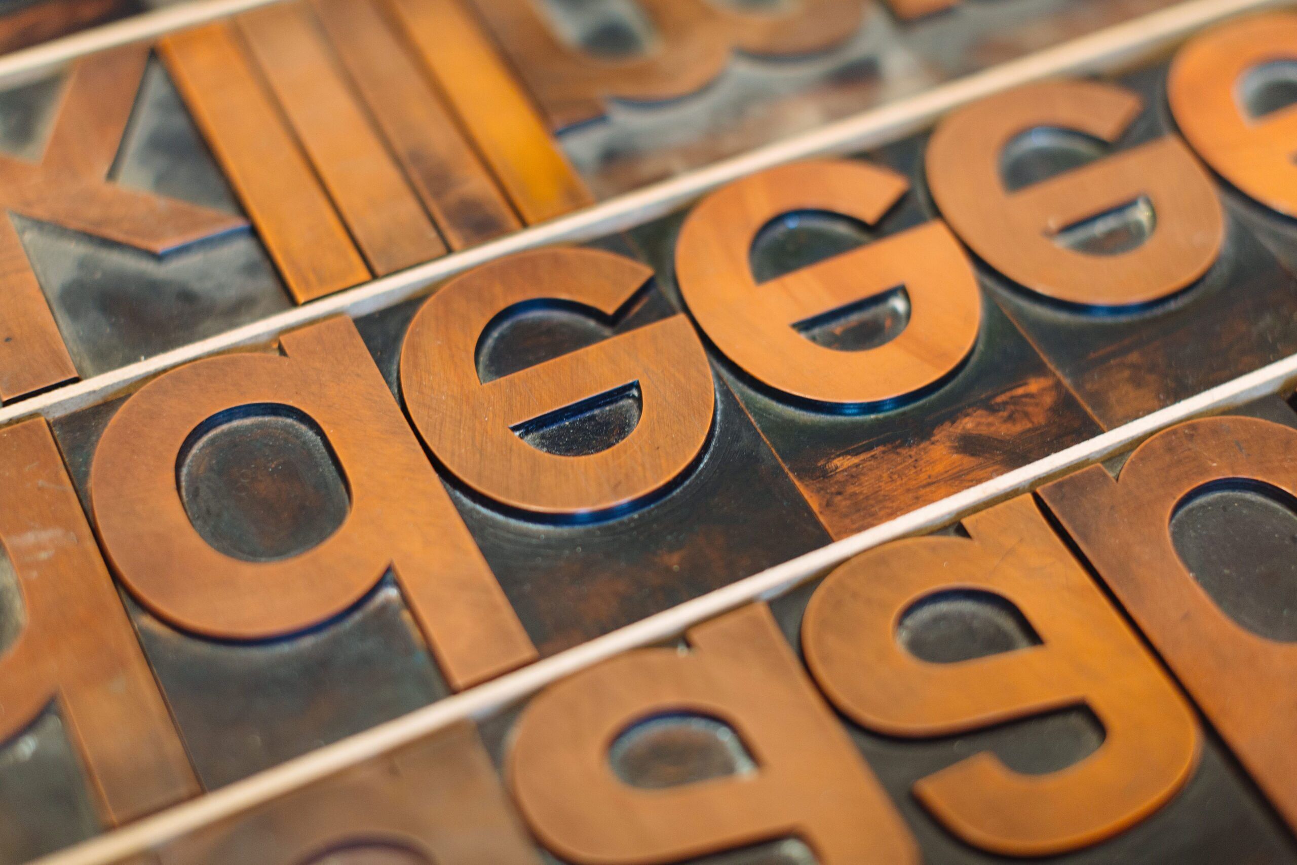
We at p98a, however, prefer our new type to look as even as possible, not only because wear and tear will add their traces over time anyway, but also because we want to show that letterpress printing can look contemporary and not just nostalgic. One material we have only just started to try out is Formica, known in Germany as Resopal: layers of plywood with a top layer of that indestructible stuff. If it resists the wear and tear on a kitchen table, it’ll also withstand printing with inks. It cuts clean contours and carries ink really well, so it may well be the stuff for future display type. You can even get it in many colours, an effect that could be exploited to signify different sorts or sizes.
The only thing stopping us from having dozens of new typefaces made into new wood type in many sizes is the cost: a small font of some 512 characters in, say, 12 line comes to at least €/$1200, i. e. about 2.50 a character. This gets you way more characters than a minimum font would have done when wood type was still made commercially. Most of the old fonts in our collection have only 2 capital letters each, 4a, 4e, 2 figures each, etc. Enough for just a few words, but hardly sufficient for complete sentences.
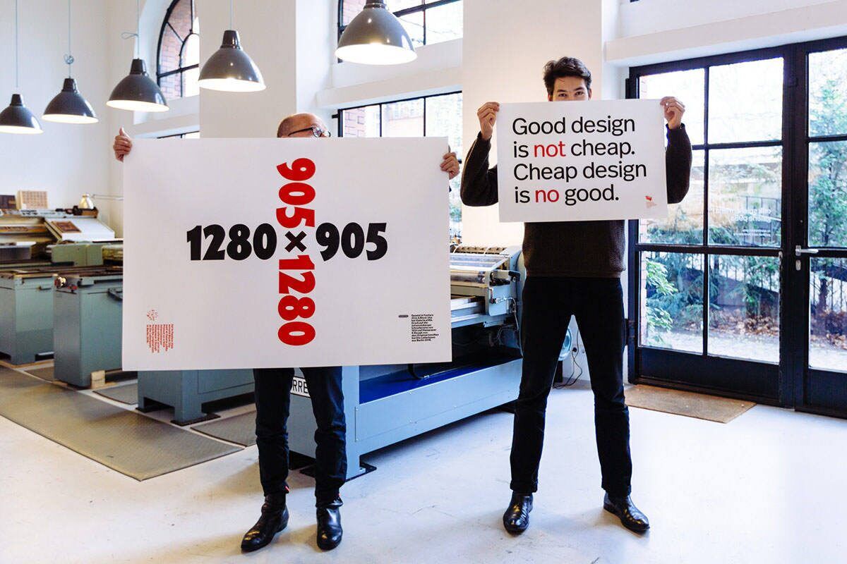
Occasionally, we’ve turned necessity into a virtue: when I realized that our Akzidenz Grotesk Medium in 20 cicero that I had picked to set the poster “Better done than perfect” only had four lower case e’s, I simply left one e out, inadvertently coming up with a pun. That may seem clever in hindsight but will get tiresome if done intentionally.
Working with large wood type from old collections does drive one lesson home: necessity is the mother of invention. You’d better go with the flow. Celebrate constraints, make the system work for you. After having spent years in front of a screen that offers 17.1 million colours and access to all the images and fonts in the known universe, we find it refreshing having to live with limited choices. Aren’t the best meals often those that happen when you think you have nothing to eat in the house? Then you open the fridge door, grab what you can find and make something up. It feels satisfying having escaped the pressures of shopping or looking through menus with too many choices, at least for one day. That is what it feels like working with wood or metal type and old machinery. Making our own type is like baking our own bread. It may never be perfect, but it’ll taste better than anything from the shop.
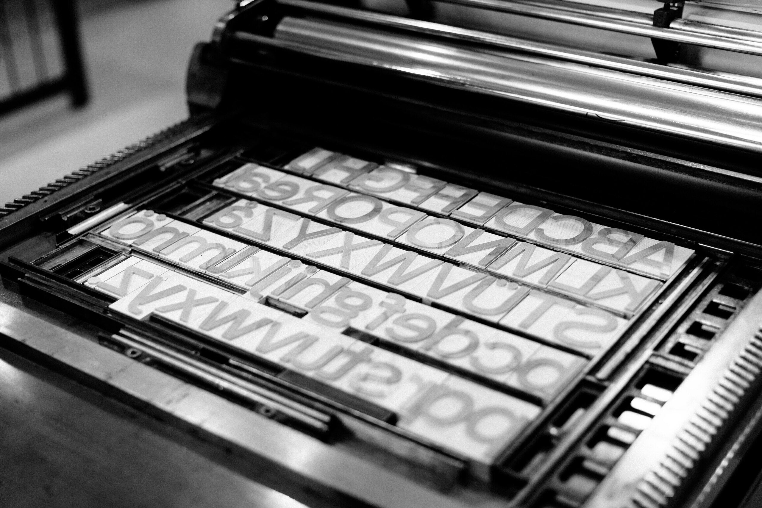

Photographs mostly by Norman Posselt
and some by Ferdinand Ulrich