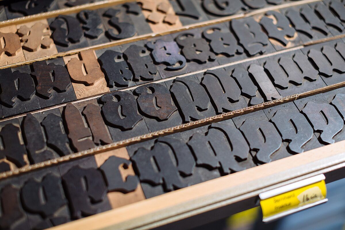
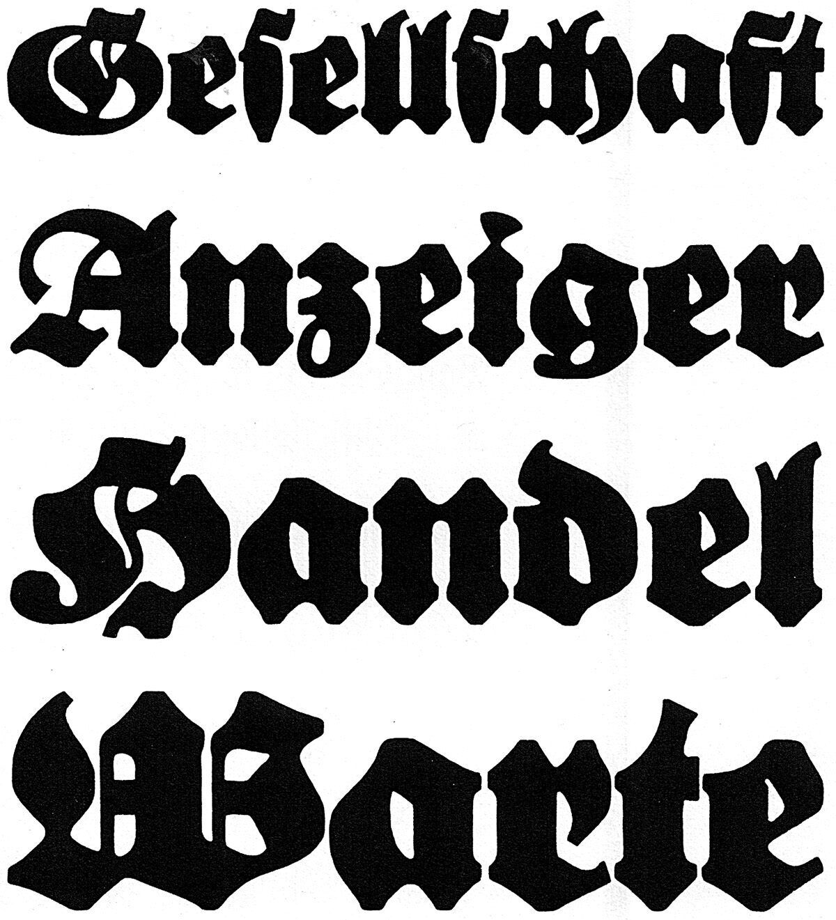
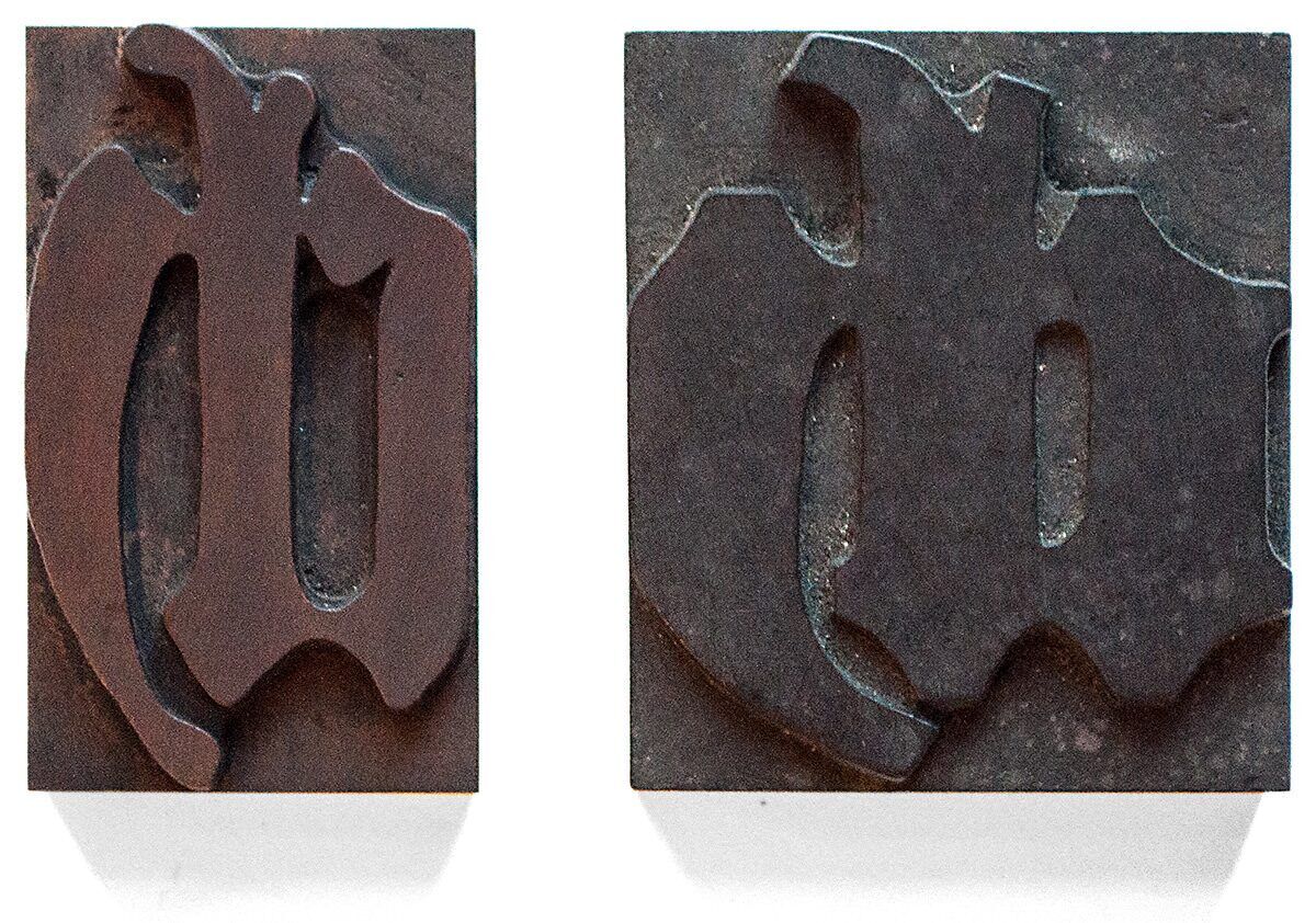
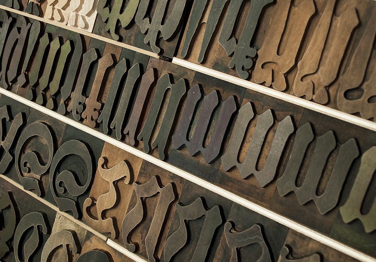
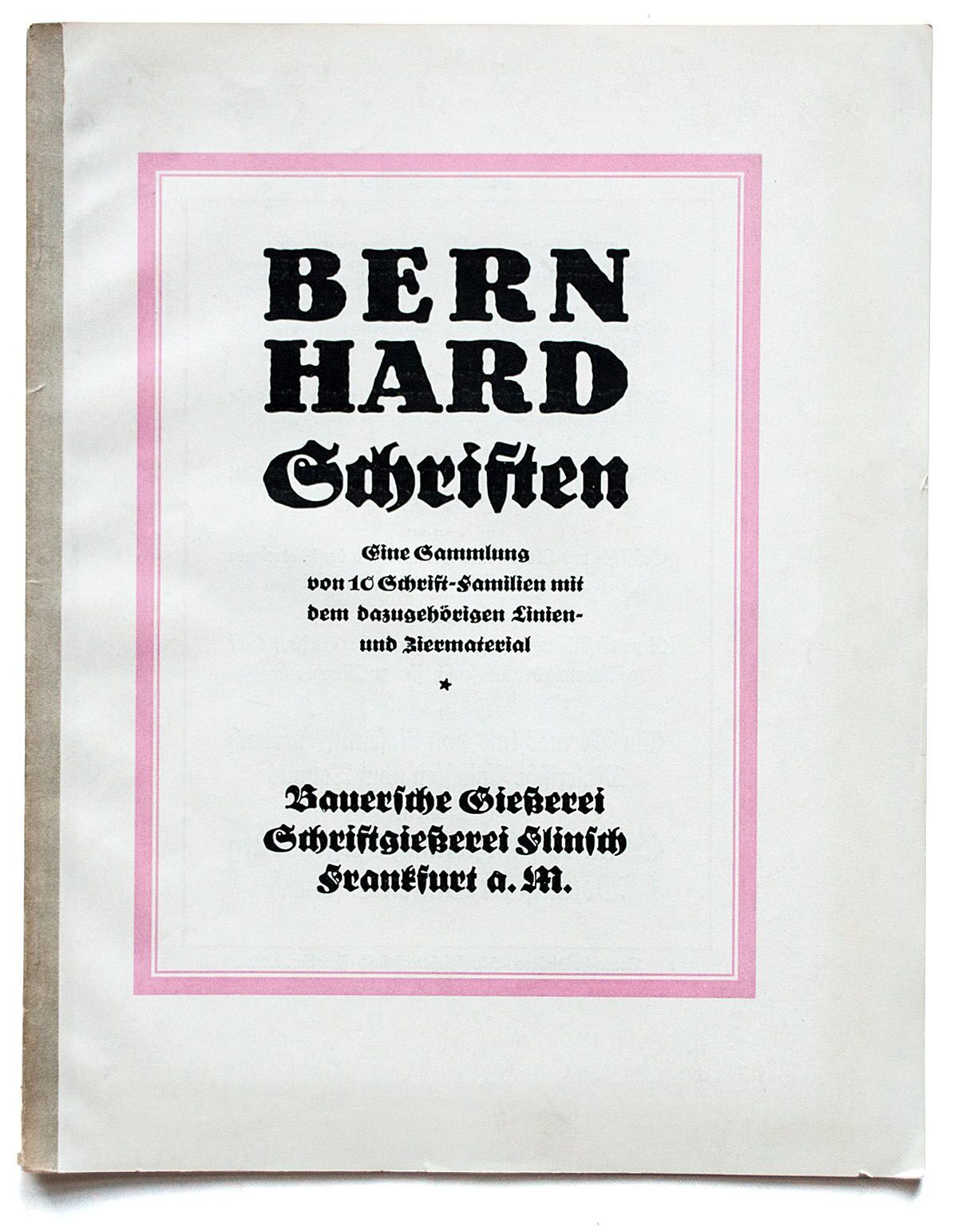
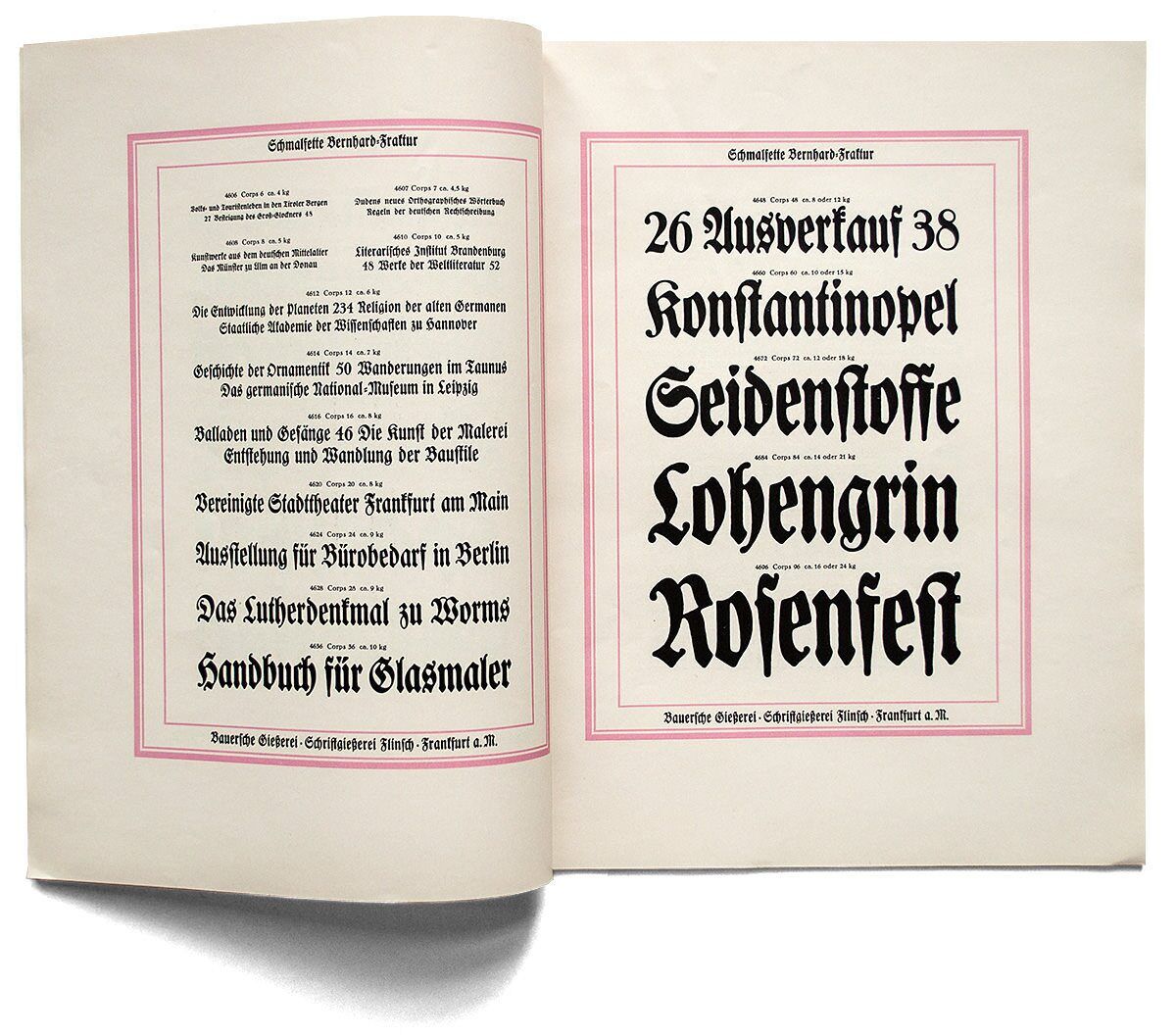
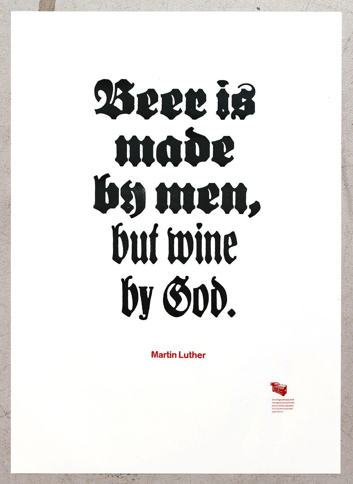
For historical reasons blackletter typefaces are having a hard time in Germany. Actually you can only really use them for beer sayings and Martin Luther quotes nowadays. Bernhard Fraktur is harmless and friendly-looking and we happily use it for both (also for wine sayings). Designed in five weights from light to extra bold by Lucian Bernhard, it was released between 1913 and 1926 by the Frankfurt-based type foundries Flinsch and Bauer.
