Inline styles were popular companions of upright weights in geometric sans families of the late 1920s and early 1930s. Although the »lichte Grotesk« – as this style is known in German – was around at least for a decade before the rise of Futura, Kabel, Elegant Grotesk et al. Three sizes of an inline-style typeface are the most recent addition to our metal typeface collection and immediately provoked a debate on whether we had purchased Ludwig & Mayer’s »Lichte Fette Grotesk« aka Phosphor, Stempel’s »Lichte Reform Grotesk« or Reflexschrift Helios.
The German noun »Licht« means »light«, while the adjective »lichte« translates as »sparse« and is not to be confused with »leicht«, »light« in English, which is another established term in the anatomy of type in both languages. Therefore »light« is actually an unfortunate, but common translation of »lichte«. »Inline« best describes the design of this style, although the outline is just as significant. In the type specimens of the time, a »lichte Grotesk« would have also been advertised as a »Zierschnitt«, suggesting it is a decorative weight to be used in display sizes.
Weights or single typefaces that follow this style may simply be drawn in closed outlines (i.e. Lumina, 1928), but usually stroke endings are open, lending the impression of parallel strokes (Elegant Grotesk, 1929). The idea of an inline is provoked by the negative space between the strokes and can be enhanced by additional strokes (Reflexschrift Helios, 1928) – Prisma (1931) is a popular example of this feature.

Outlines modifications and other reverses of solid-faced types can be traced back to the 20s and 30s of the nineteenth century (several examples can be found in Rob Roy Kelly’s American Wood Type, New York, 1977). Some early sans serifs called »lichte« in Germany were Lichte Untergrundgrotesk (that also had a solid counterpart) in 1910 (Ludwig & Mayer) as well as Lichte Reklame-Reform-Grotesk in 1913 (D. Stempel AG), both very similar by design. Inline styles associated with geometric sans serifs followed in the 1920s.
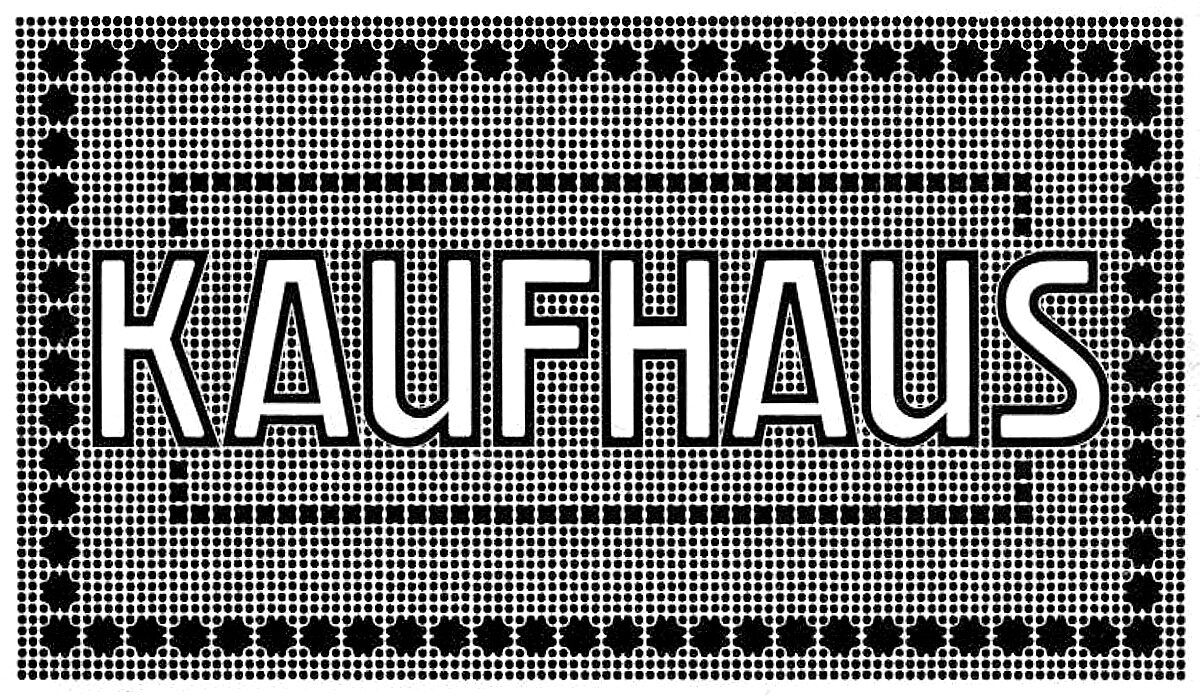
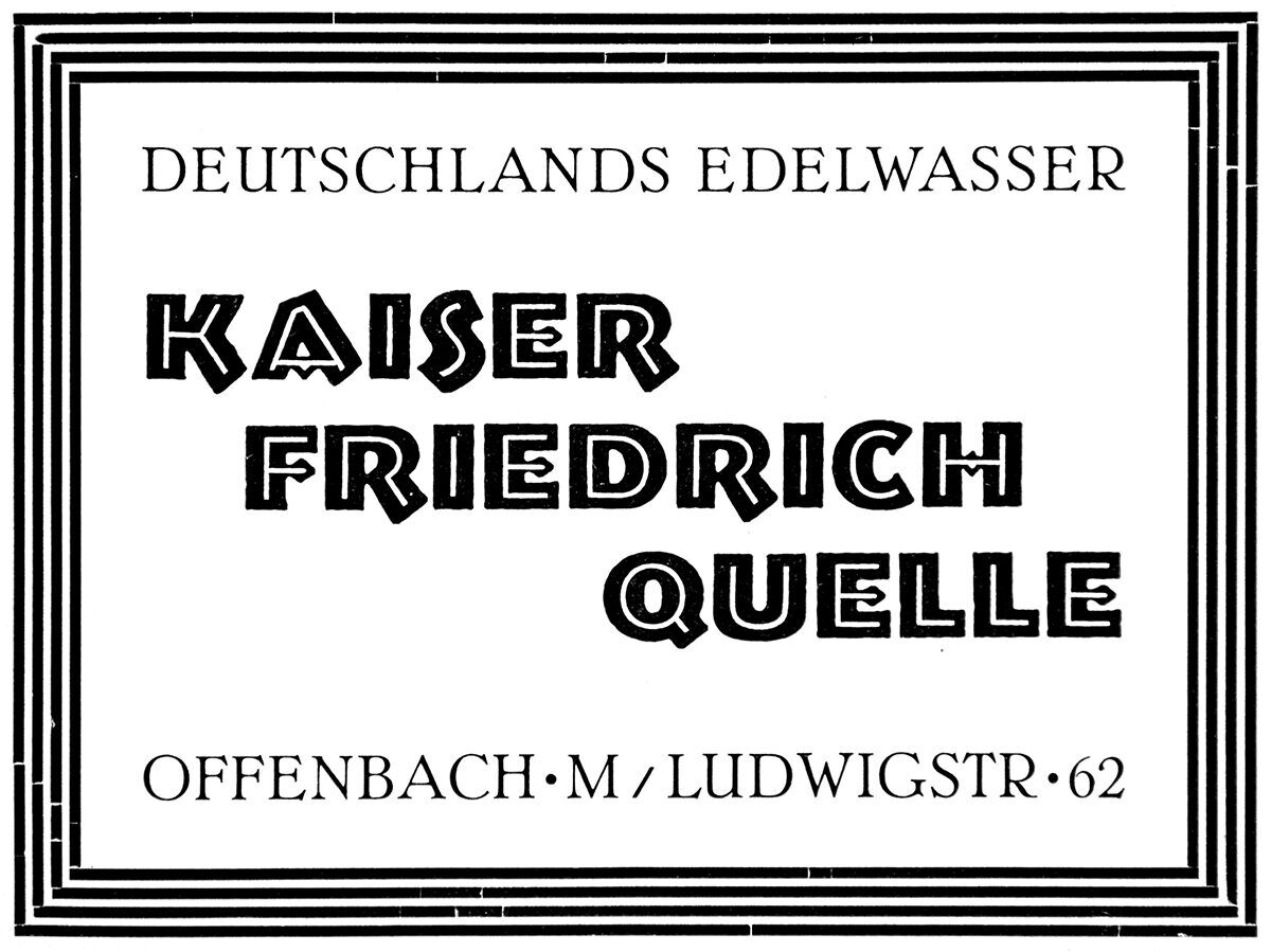
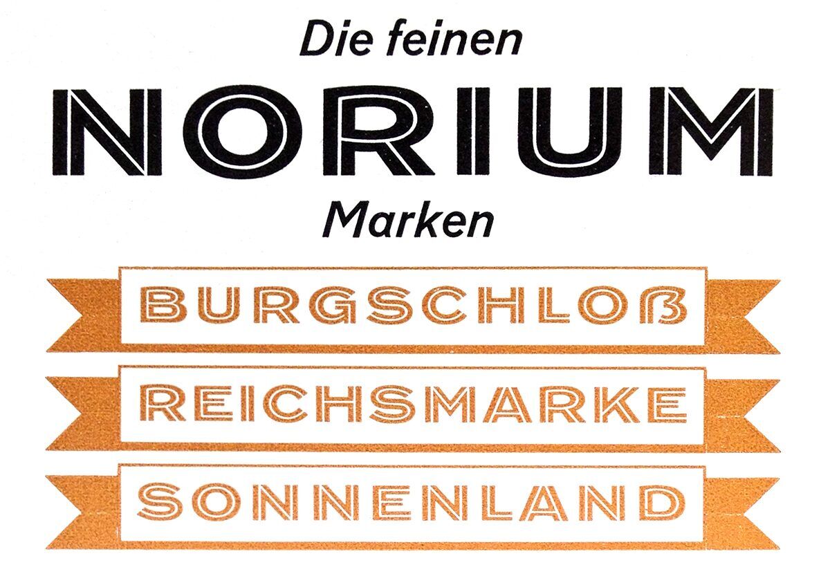
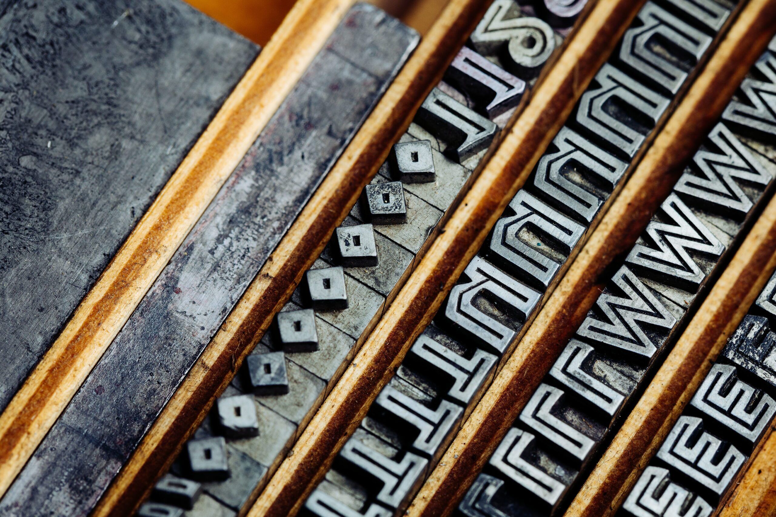
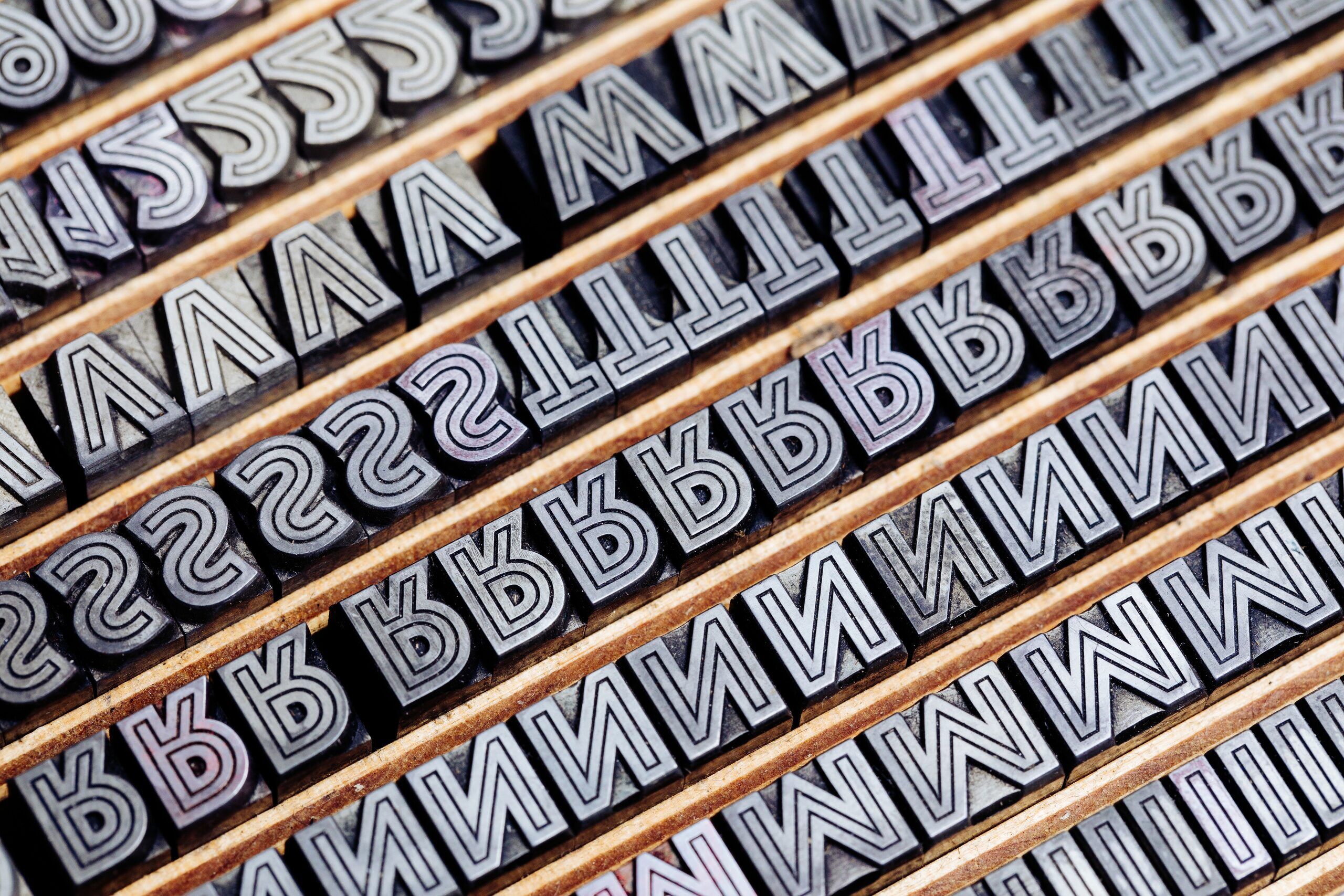
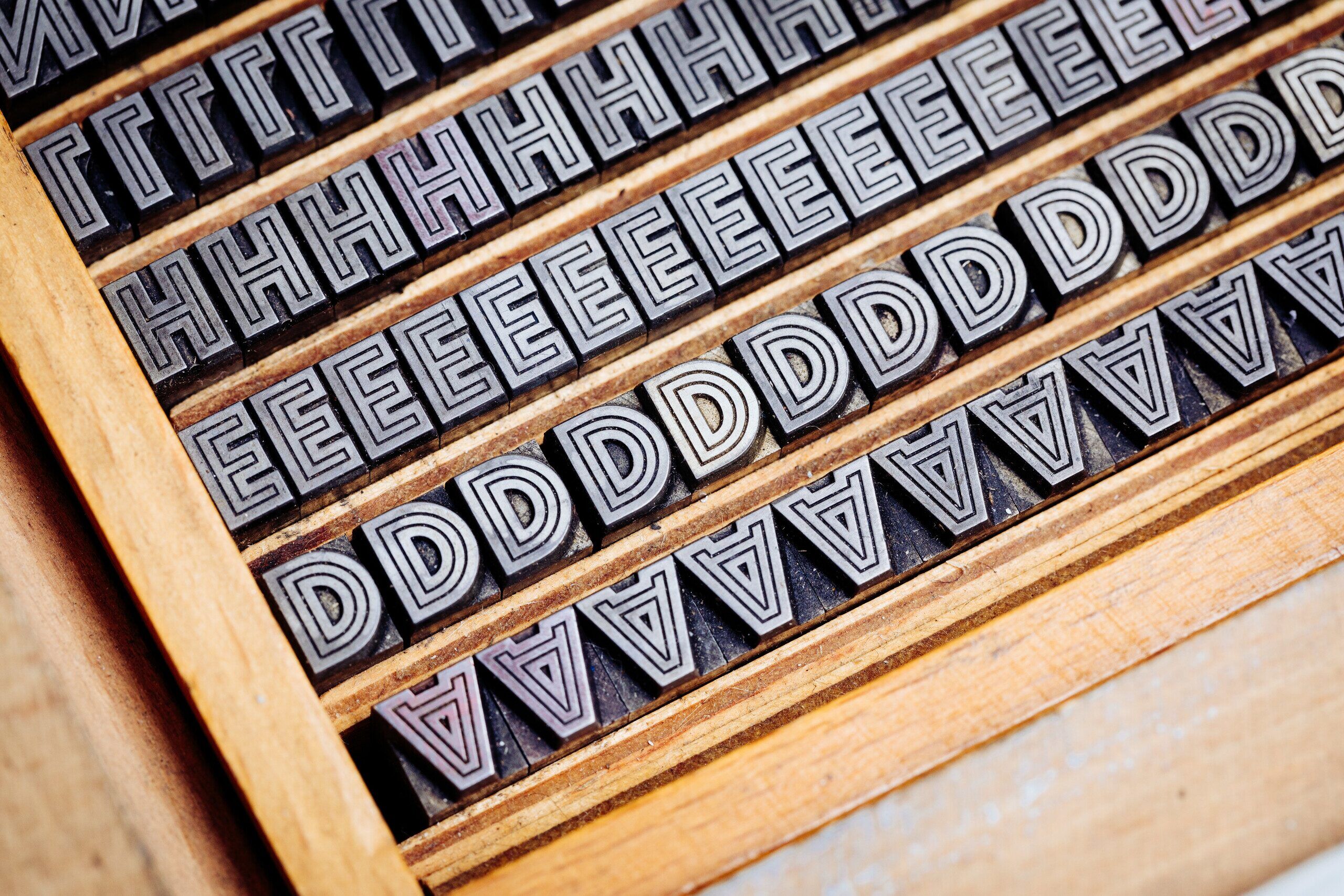
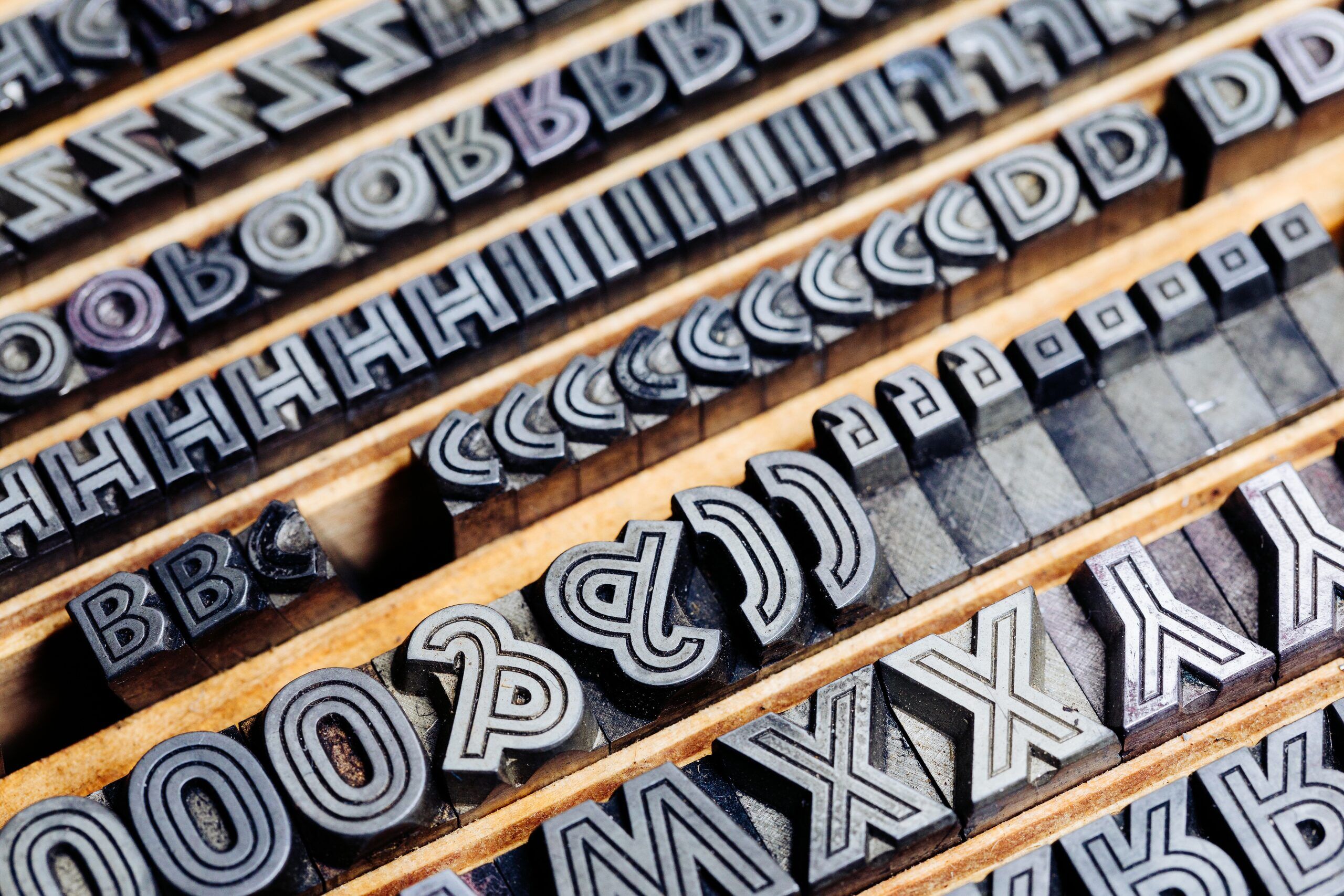
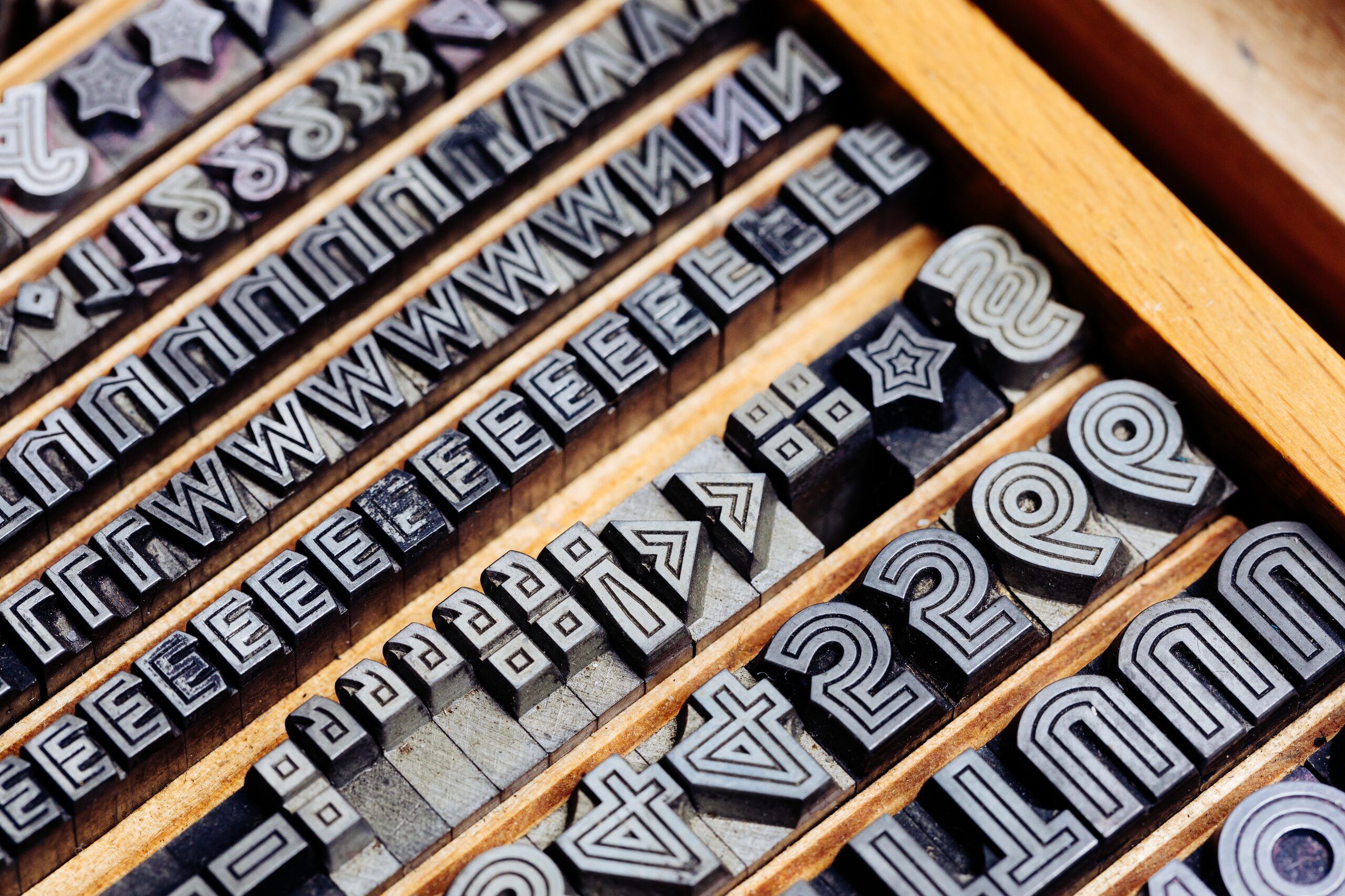
As it turns out, the type that recently arrived in the workshop in 20, 24 and 30 point (30 is quite an unusual Didot size) is »Lichte Fette Grotesk« by Jakob Erbar, released with Ludwig & Mayer in 1924. Originally an all-caps face, it is bold in appearance with a thin white line enclosed in the shapes. Some have suggested that this design paved the way for the geometric sans Erbar Grotesk, released in 1928. This may be indicated by diagonal terminals in the alternative letters for K, R and Y as well as in other letter proportions. Stempel later licensed the typeface as Lichte Reform Grotesk, while the rather generic name was changed to Phosphor for better advertisement abroad.
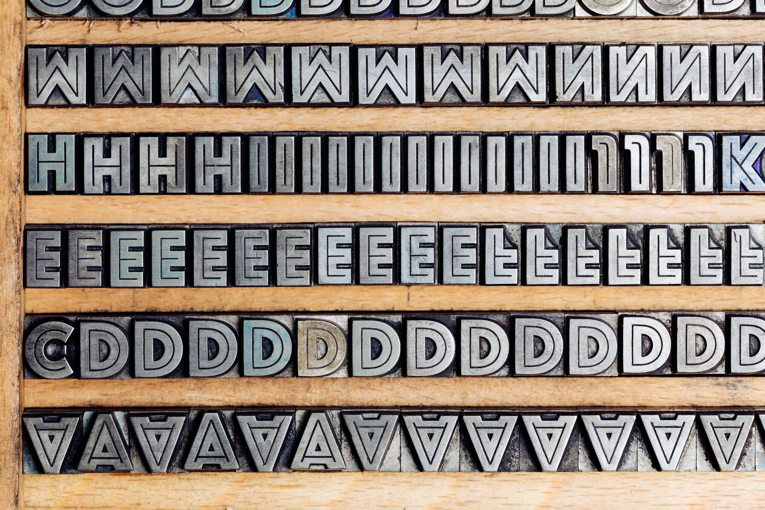
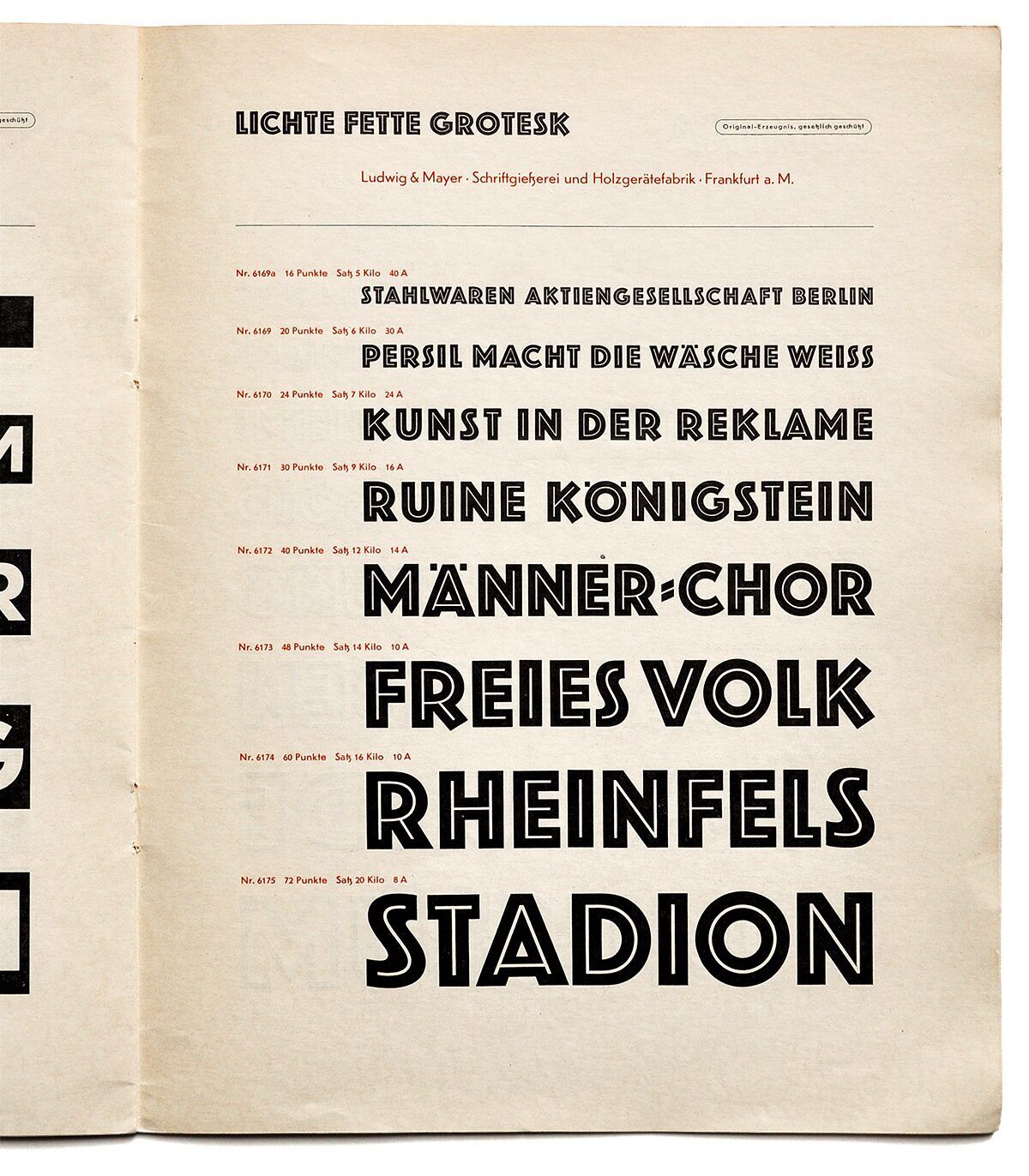
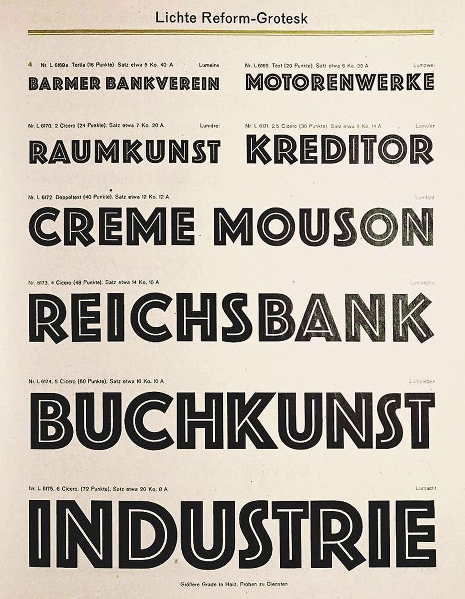
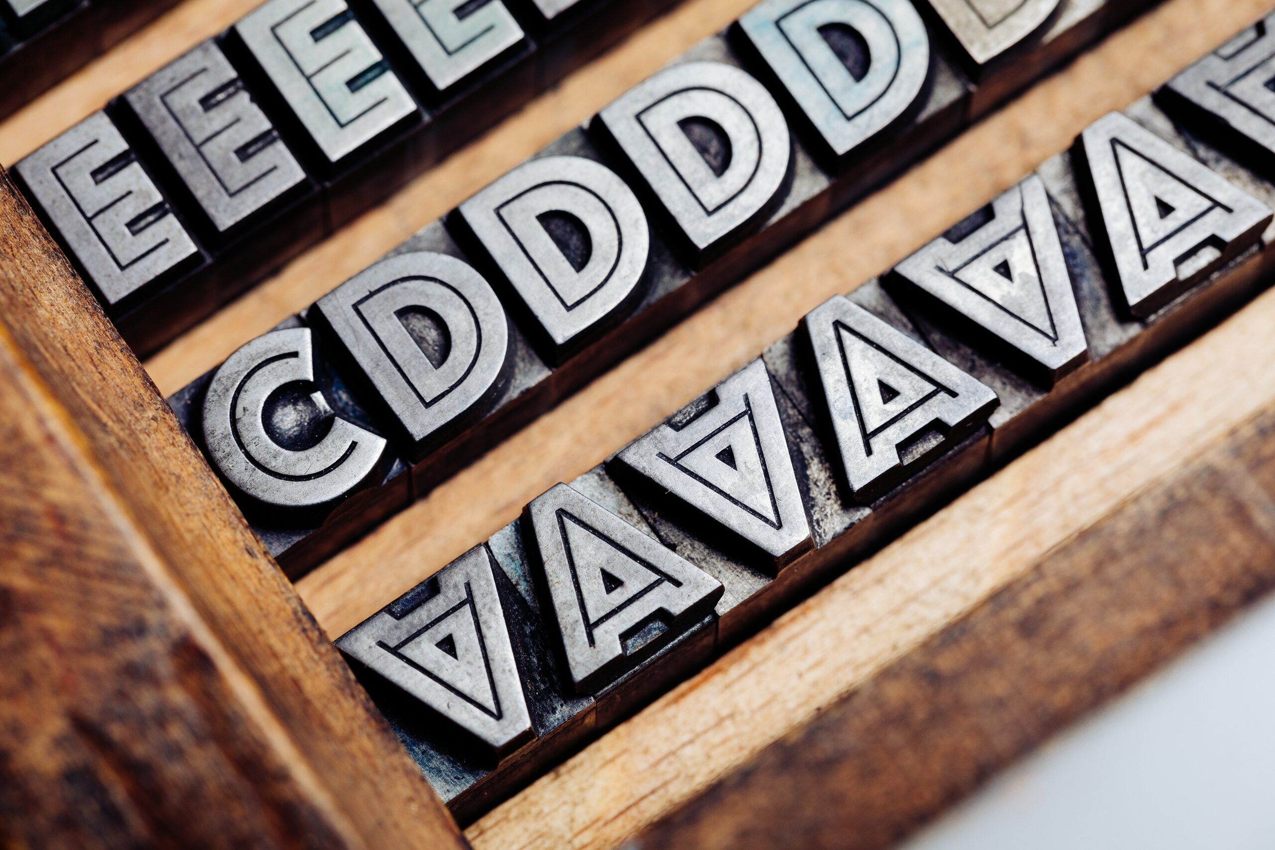
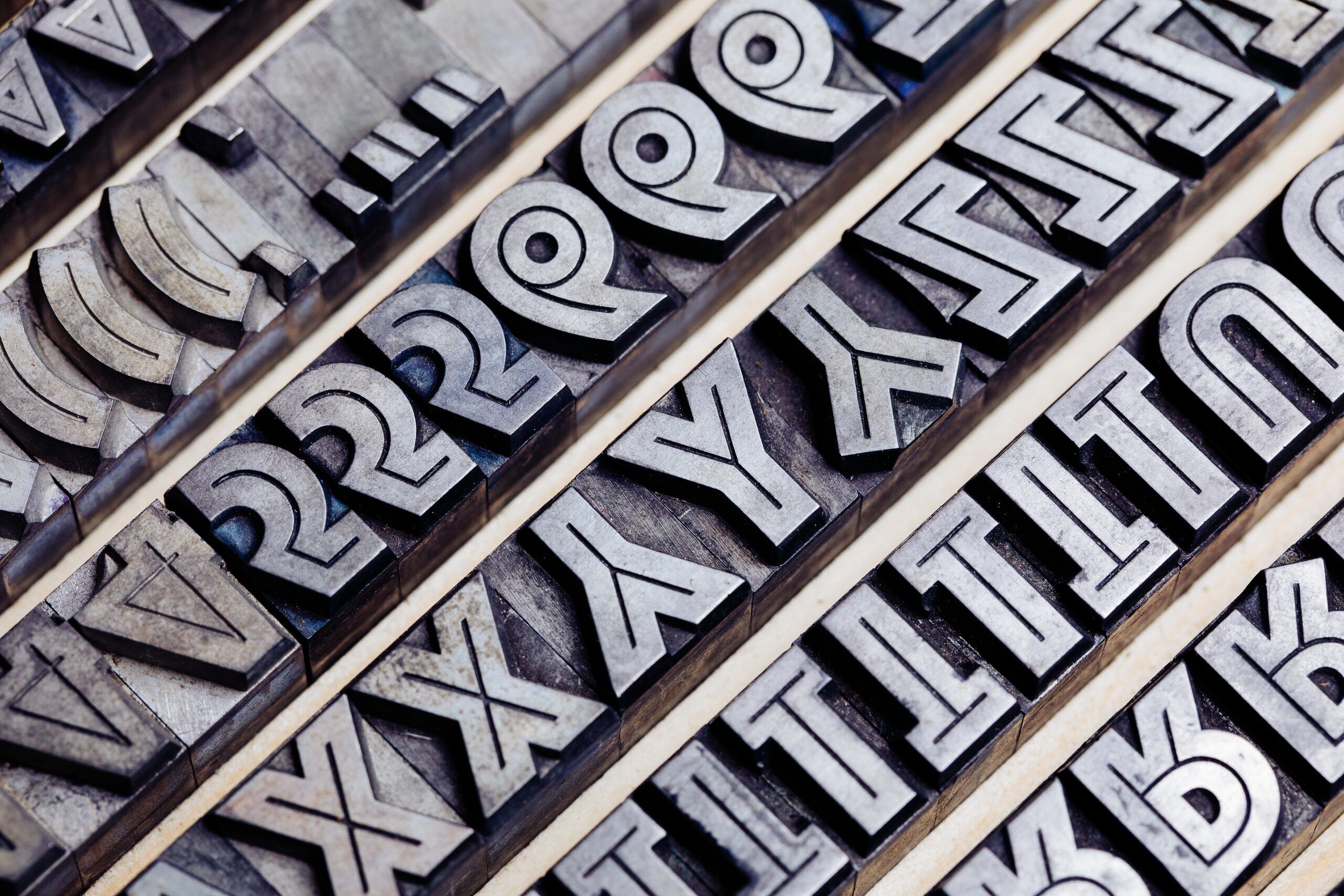
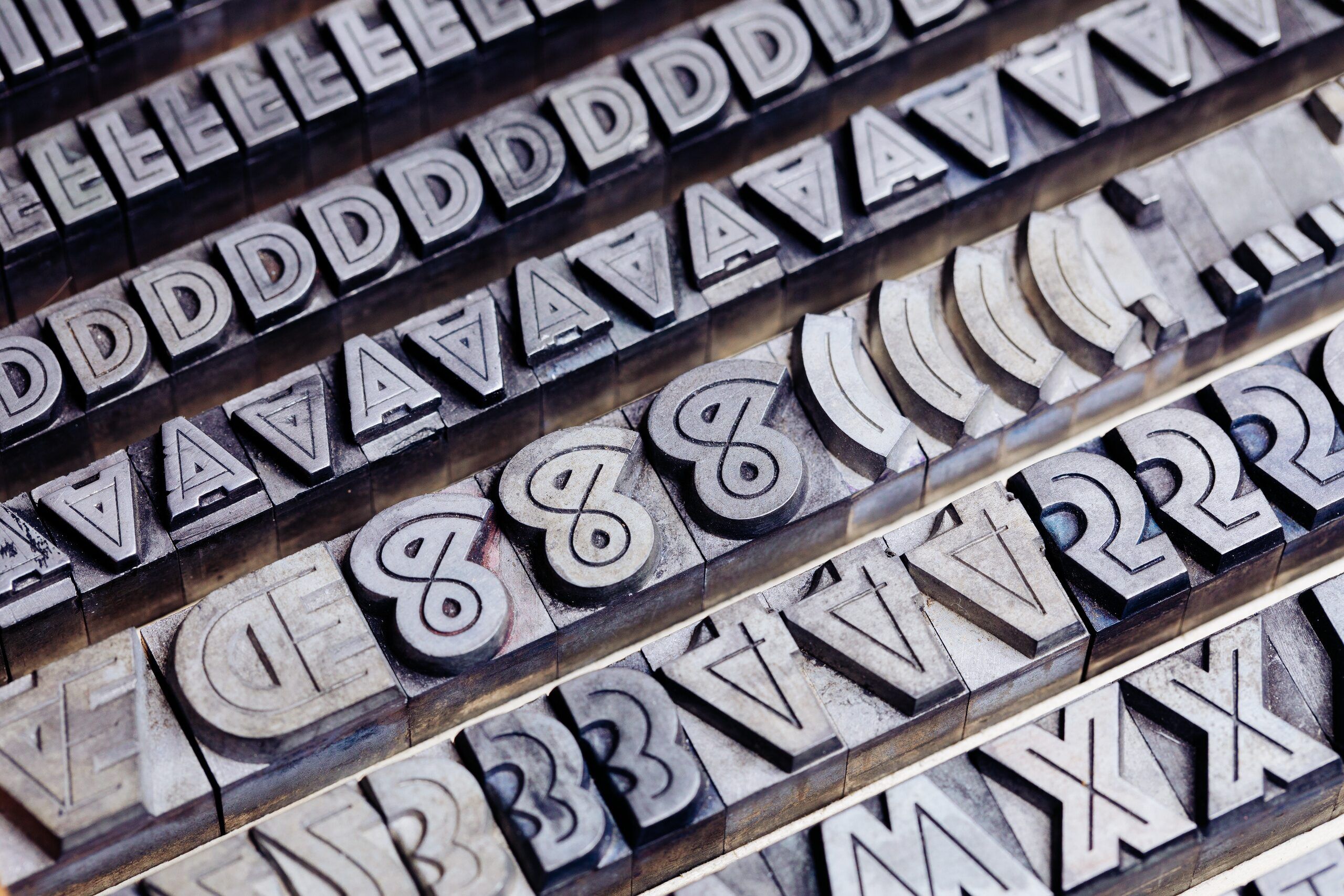
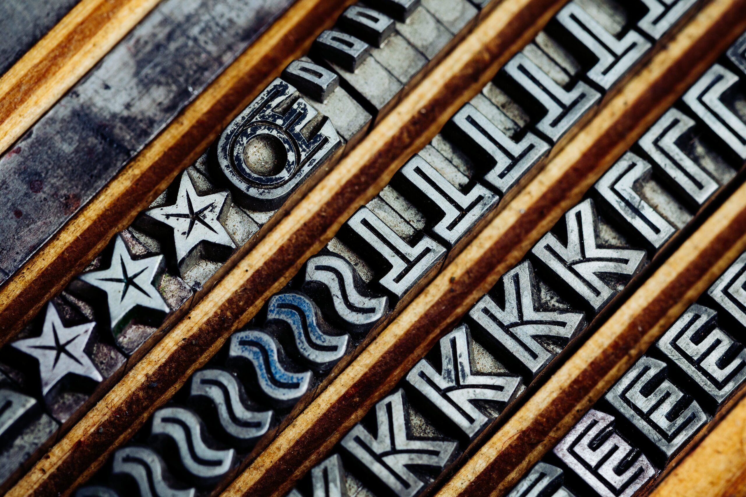
The inline style seemed to be quite popular as it reoccurred in several other typefaces the following years. Fette Lichte Koralle (1927, Schelter & Giesecke), Kress Schrift and Drescher Versalien (both 1927, Schriftguß AG, formerly Brüder Butter) are good examples. Messe Grotesk (1927, Aktiengesellschaft für Schriftgießerei), Xylo (1927, Benjamin Krebs Nachfolger) and Rudolf Koch’s Lichte Neuland (1928, Gebrüder Klingspor) in particular are not too dissimilar, but more rustic. Another related typeface that we have in the workshop is Reflexschrift Helios (1928, Ludwig Wagner). Helios is clearly connected to Phosphor, but appears slightly more elegant with its double inline. Our friend and colleague Florian Hardwig has collected beautiful in-use examples of both typefaces. In 1929 Lumina (Ludwig & Mayer) followed as Phosphor’s outlined sister.
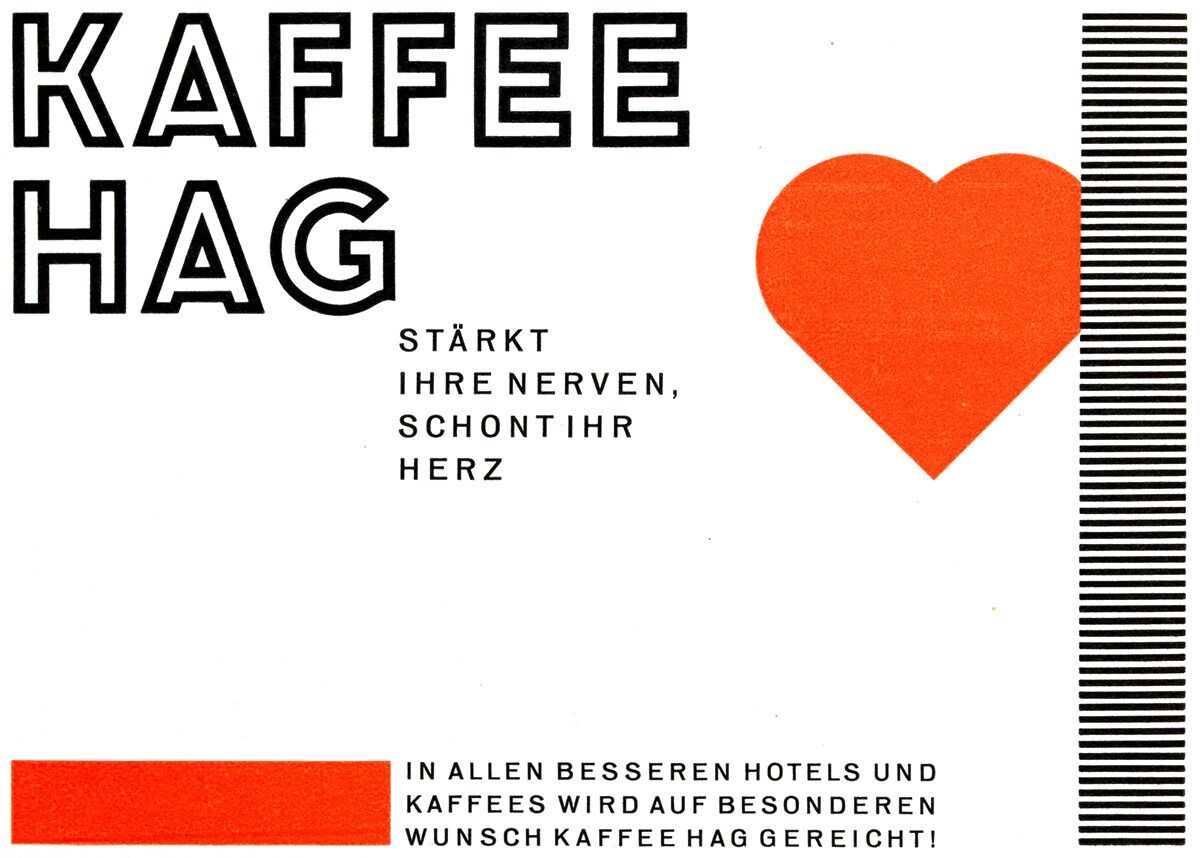
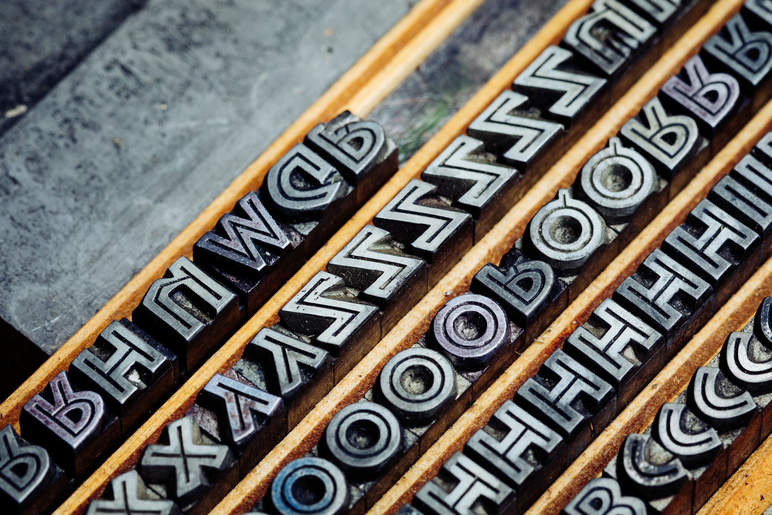
In preparation for this article we realised that a 12 point Lichte Neuland had hidden between two sizes of Helios all this time – what a joy to officially add it to our workshop type catalogue! The solid-face Neuland was designed by Rudolf Koch in 1923 and legend has it that the punches were cut by himself, lending the letterforms a coarse look. The inline version of Neuland is probably best known for its use in the iconic Jurassic Park movie poster (obviously squeezed a bit too much).


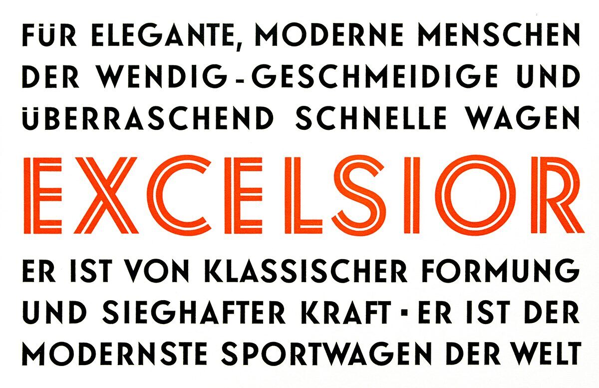
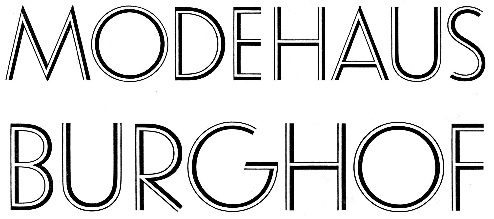
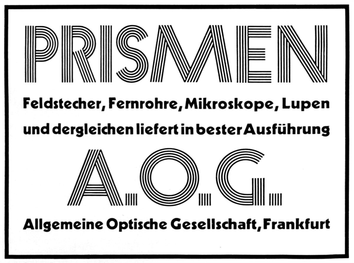
Lichte Elegant Grotesk (1929, D. Stempel AG) marks the beginning of inline weights released as companions of solid-faced geometric sans serifs. While Lux (1929, Ludwig & Mayer) compliments Erbar Grotesk, Zeppelin (1929, Gebr. Klingspor) is Kabel’s pal. Both are rather unconventional designs consisting of a bold and a thin stroke. Prisma (1931, Gebr. Klingspor) is perhaps one of the most popular »lichte« designs of its era, significantly through its five-line stroke. Although it was advertised as part of the Kabel family, it does not share the overall design apart from some details and can also be regarded as a type of its own. In 1931 inline weights for Futura and Berthold Grotesk followed.
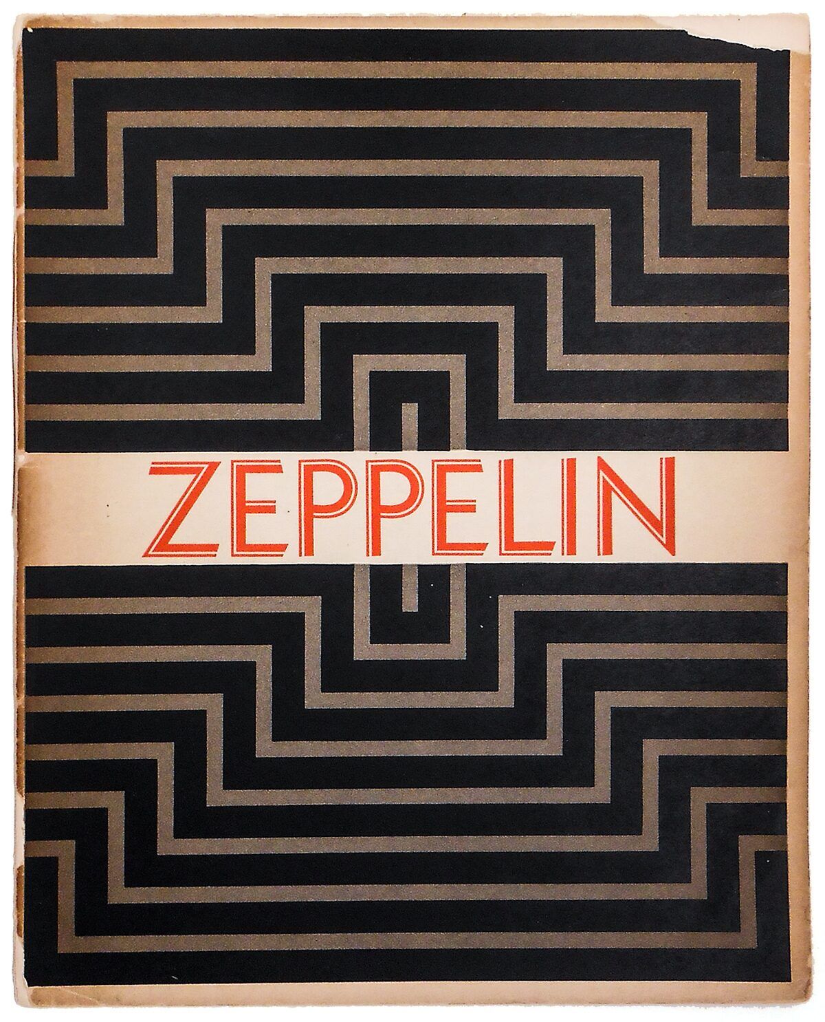
In the mid-1930s blackletter faces began to supersede the trend of geometric sans serifs, but the »lichte« style survived. As a result German type foundries produced complementing weights such as Lichte National (1935, Schriftguß AG) and Lichte Tannenberg (1935, D. Stempel AG).
In the late 1960s and early 1970s the inline style made another comeback, most notably in the prismatic 1968 Olympic Games logo.

- Lichte Fette Grotesk
- 20, 24, 30 p
- Reflexschrift Helios
- 20, 24 p
- Lichte Neuland
- 12 p