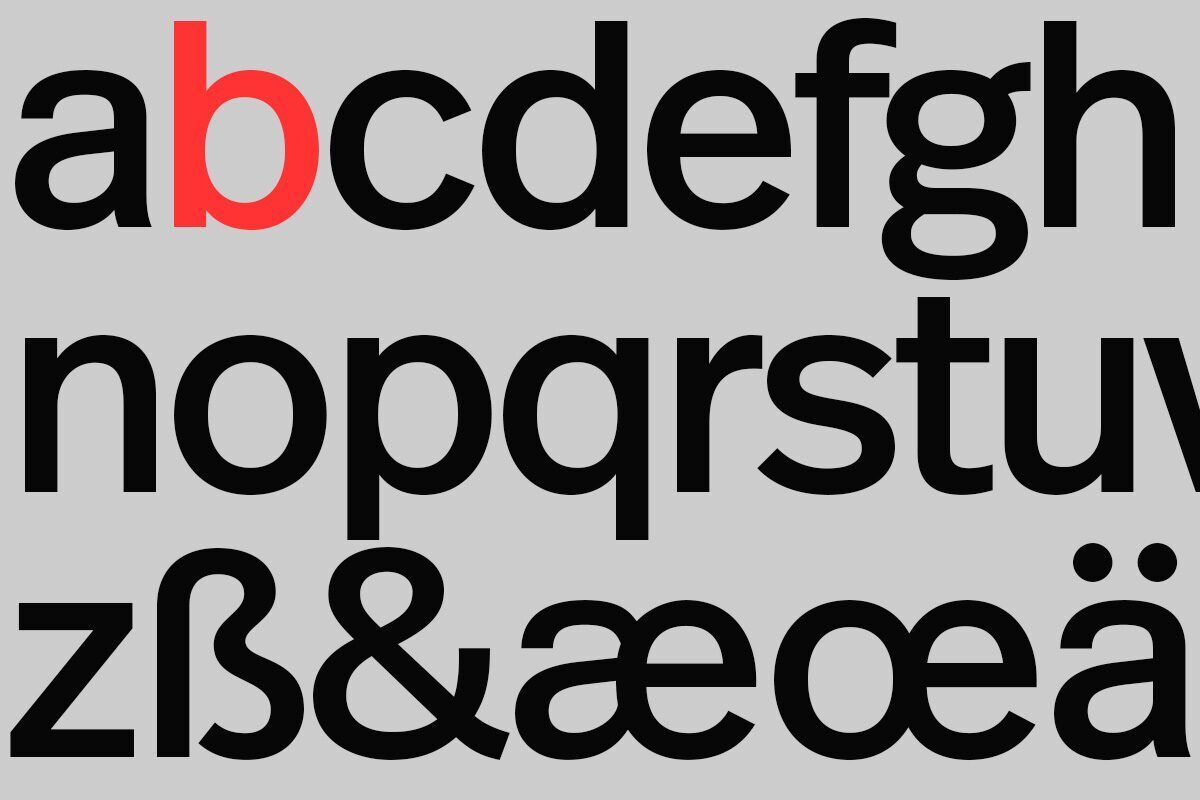
At p98a we have our own house face, of course. It’s FF Real, designed by Erik Spiekermann and Ralph du Carrois. A full-length interview about the process behind making a one-weight exclusive type into a full-blown FontFont is on the FontShop site, albeit in German. Read the short story here.
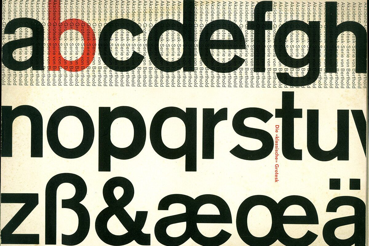
Real is based on a special semi-bold Akzidenz Grotesk weight that was only used for very large poster type. Lighter than the semi-bold in lead, phototypesetting, and digital. I have a lot of history with Akzidenz Grotesk. For me, it’s the mother of all sans serifs. The real, non-fake version, as it were, the royal sans serif face (which is why it’s called Real, apart from the fact that my typefaces have four-letter names).
Berthold grew up with AG, and I grew up with Berthold. I learnt to know and appreciate AG during design lessons with Günter Gerhard Lange. I think it remains one of the best typefaces ever, which is why I’ve had it even cast in metal for my letterpress workshop P98a — in regular and semi-bold in 8, 12, and 24 point.
I drew just one weight of Real digitally for the “Hello, I am Erik“ book, and passed the data on to Ralph du Carrois to clean up, complete the character set and add kerning. We tried to keep the essence of Akzidenz Grotesk but changed what we wanted to
Originally I only wanted one weight of Real, albeit in a headline and a text version. The book only uses that one weight, if only to prove the point that sometimes less is more. But the reality is that designers need more weights to provide typographic solutions. Ralph persuaded me to extend the family and I agreed.

