Two weeks ago we edited and designed the latest issue of Berliner Illustrirte Zeitung, a supplement published in Berlin’s daily newspaper Morgenpost. Just in time for TYPO Berlin, we created eight pages on Berlin type history, on our many colleagues who run type foundries here, on type and lettering in Berlin’s public space and on street signs in the different parts of town. The front features a letterpress forme – the back shows the printed piece: we celebrate the “Types of Berlin”, a limited edition printed by hand from original wood type on our preferred proof press: Korrex Berlin. Buy it here.
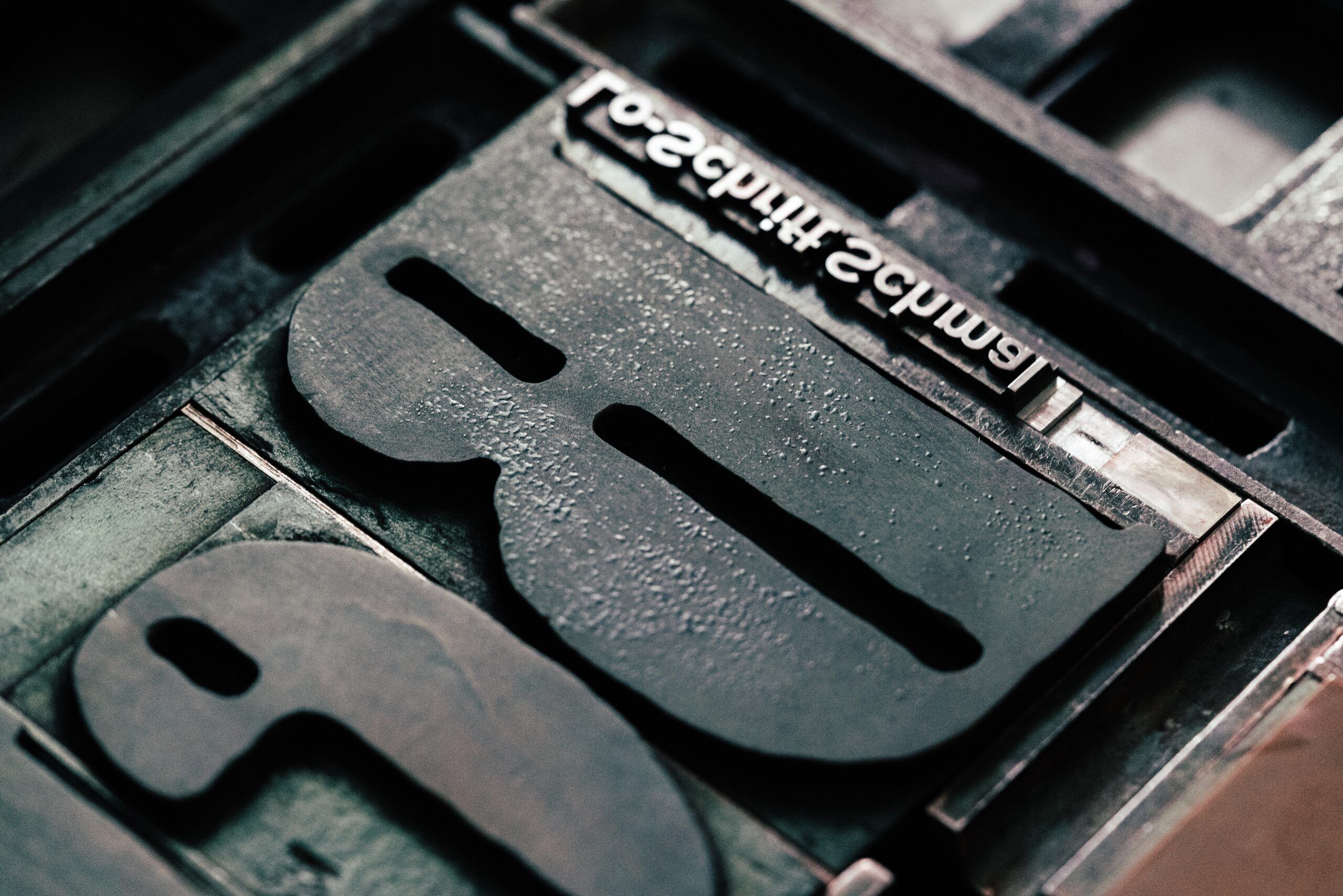
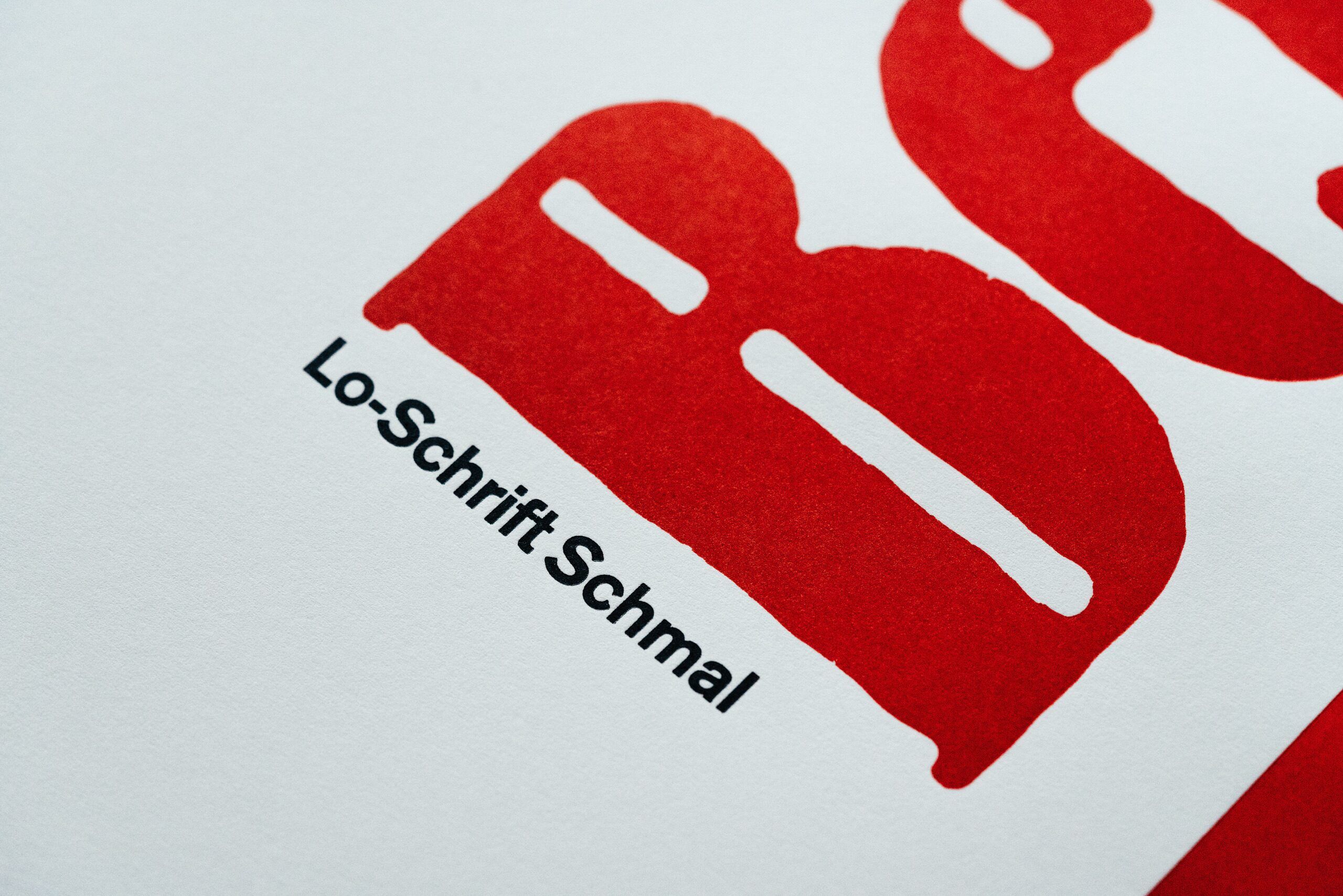
The first two weights released from Louis Oppenheim’s Lo-Schrift by Berlin’s largest type foundry H. Berthold in 1914 were this medium condensed (called schmalhalbfett) and a wide italic – strangely enough, the two weights did not correspond in stroke-width and x-height. Oppenheim’s (1879–1936) types are – perhaps unfairly – less-known than those by Lucian Bernhard (1883–1972), who worked as a graphic designer around the same time and also designed letters with wobbly contours (see Bernhard Antiqua). That style is derived from letters drawn with a brush and are resistant to even the strongest Heidelberg platen press.
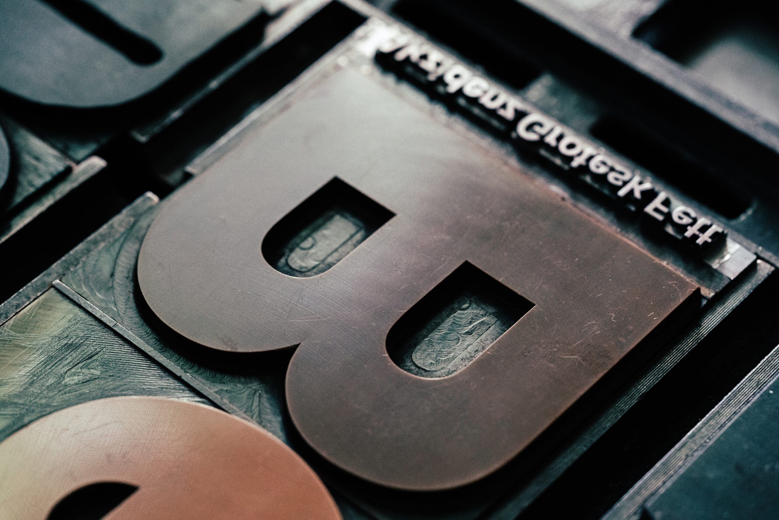
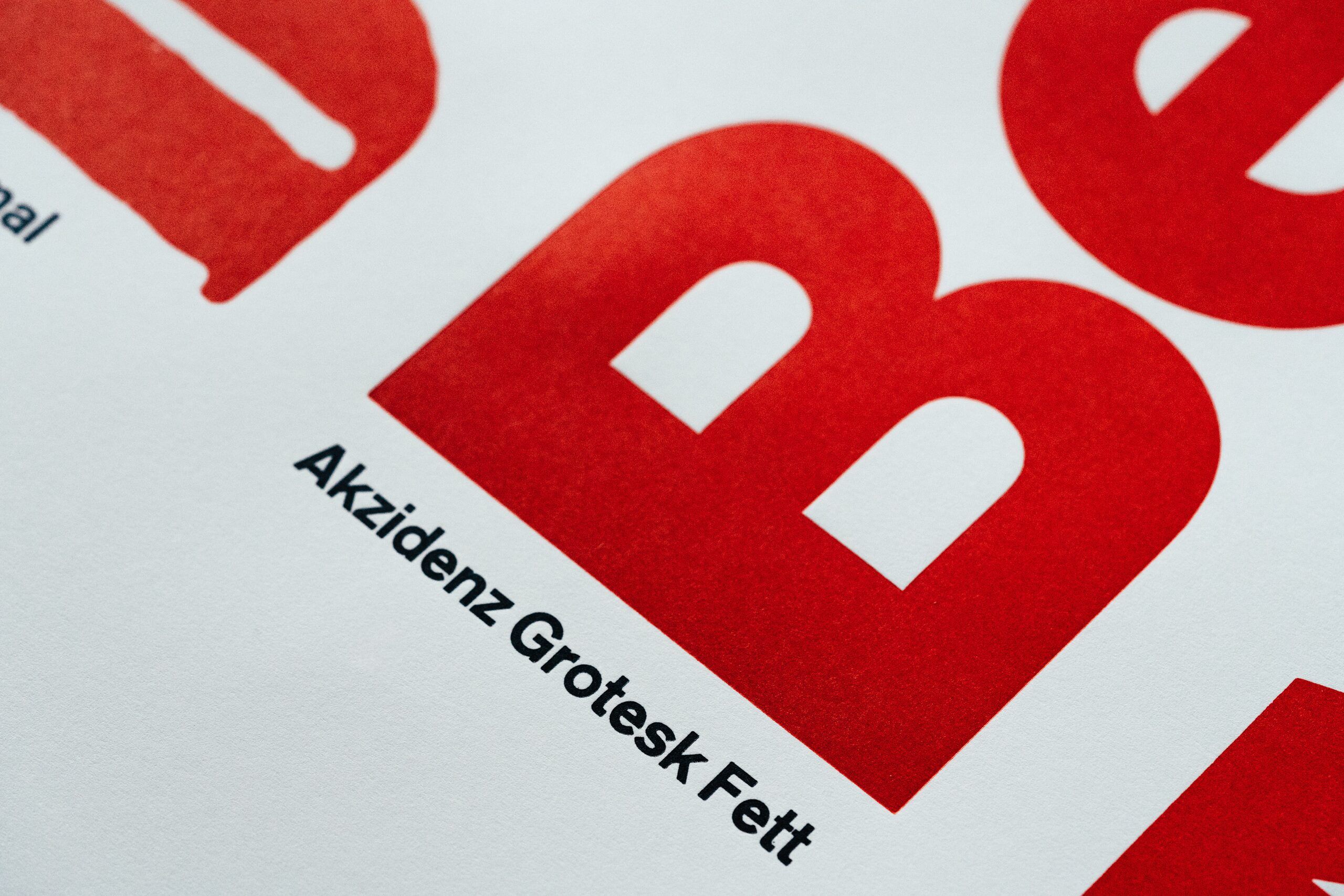
Akzidenz Grotesk has been released with H. Berthold since the late 1890s, its bold weight left the assembly line in 1909. While it is an in-house design, the type family’s paternity and origin remain unsolved – although some colleagues seem to be digging for clues restlessly these days. We have plenty of sizes and different weights of “AG” at p98a, like no other type in the workshop. Many of those metal type sizes were cast only recently with our good friend Rainer Gerstenberg who runs his own type foundry in Darmstadt. For well over a century, AG has been connected with Berlin and it has accompanied Erik for many decades, too – not least when he reinterpreted it as FF Real.
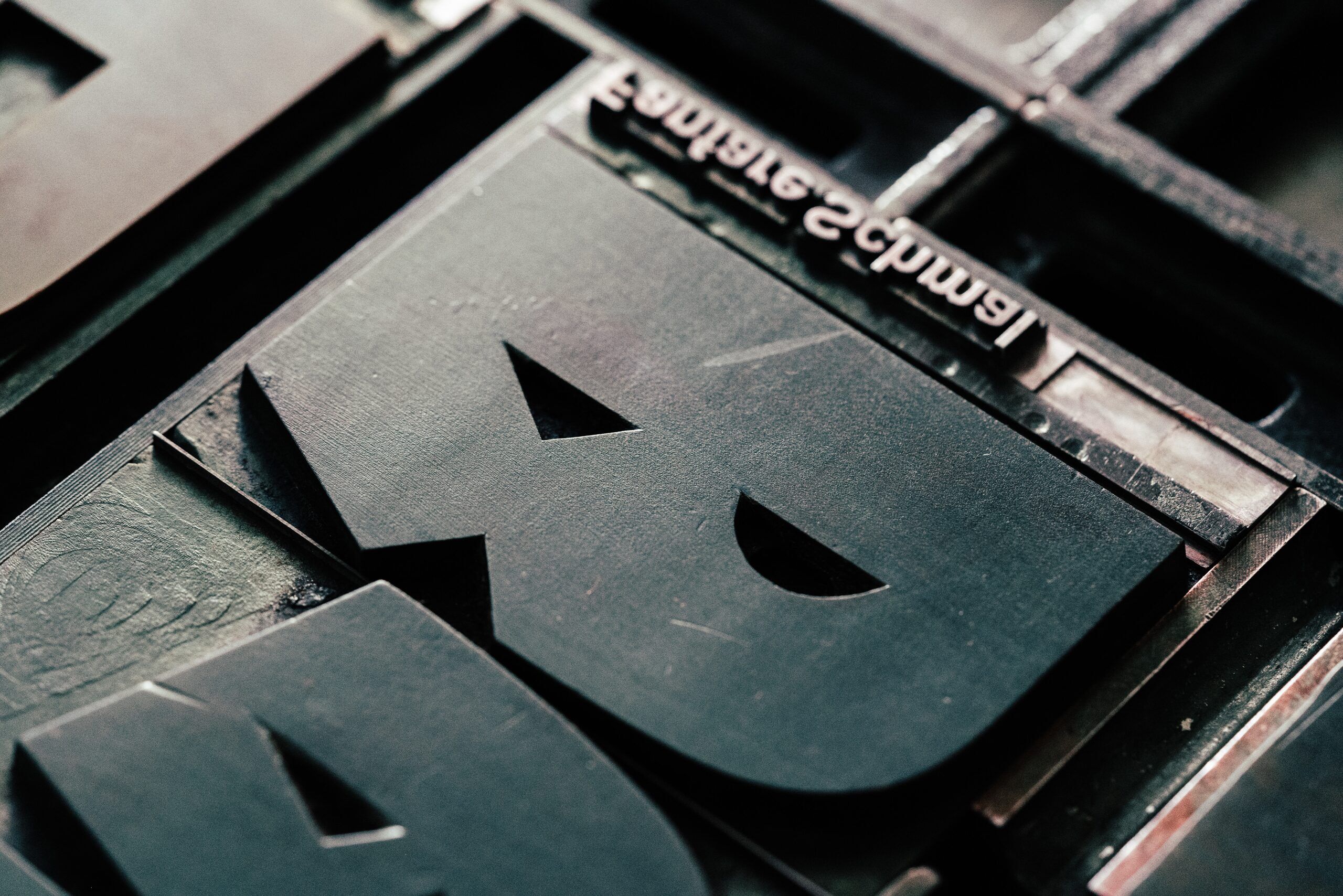
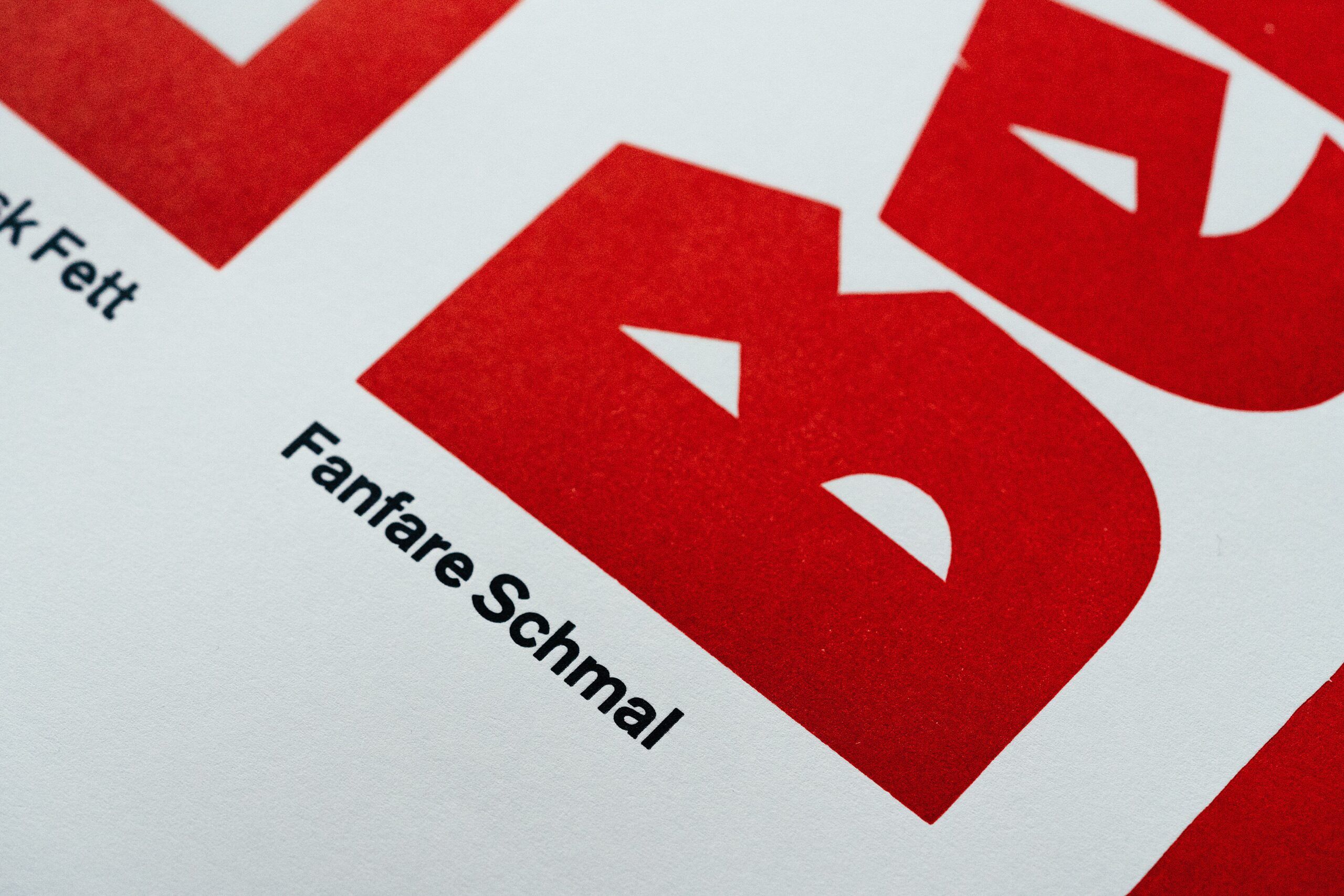
Not announced by drum rolls and trumpets, but by the beat of kettledrums and the sound of flutes, Fanfare appears both brutal and delicate: as a hermaphrodite of grotesque and blackletter it is indecisive and quite peculiar in single letters, but determined and coherent as a system. This divergence perhaps best describes the work of Oppenheim – and the city of Berlin. Fanfare is proof that Oppenheim was no one-hit-wonder and reflects his unique approach to type design. Too bad the specimen doesn’t read „Merlin“ so we could show off Oppenheim’s characteristic Batman-M with extremely sharp apexes.
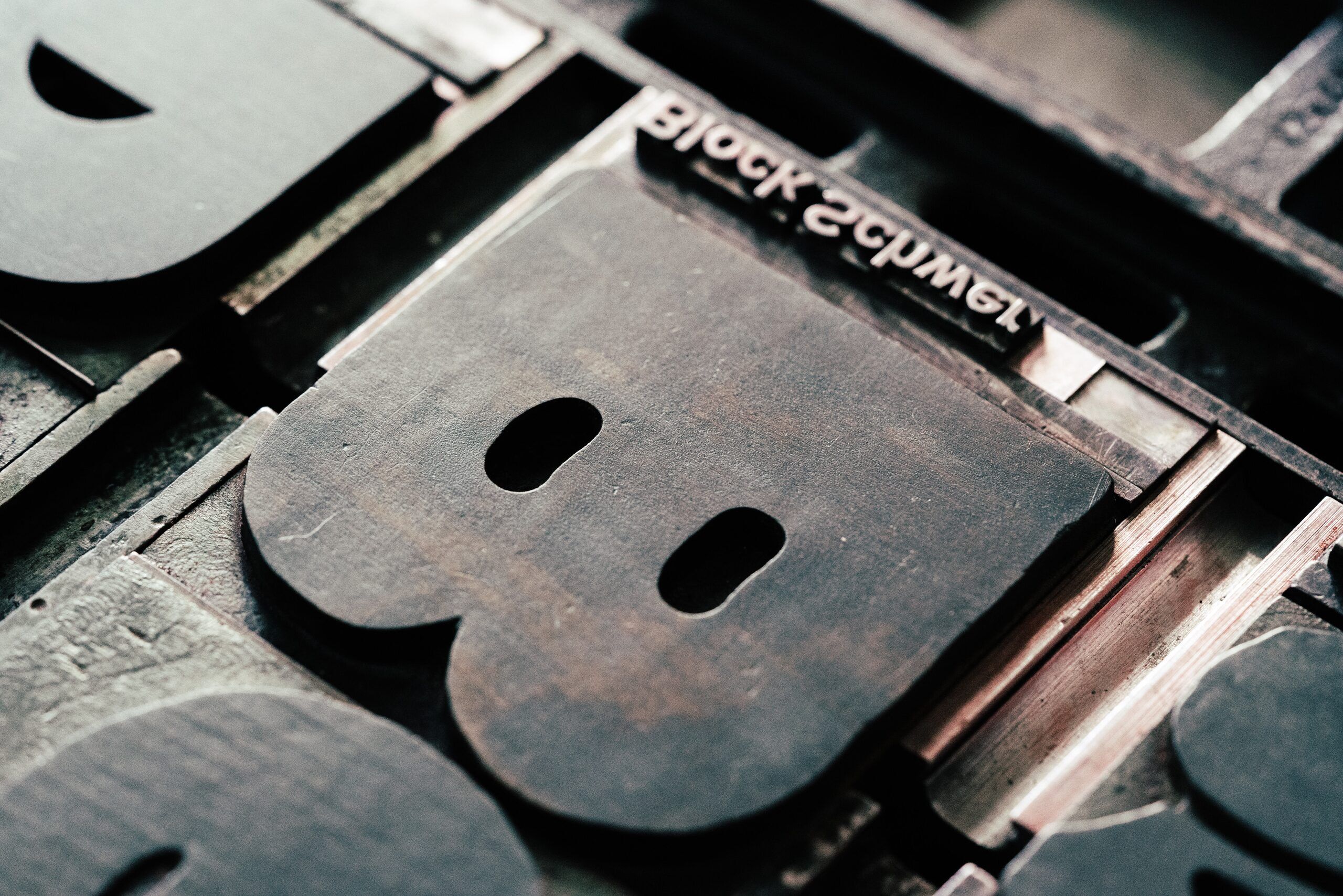
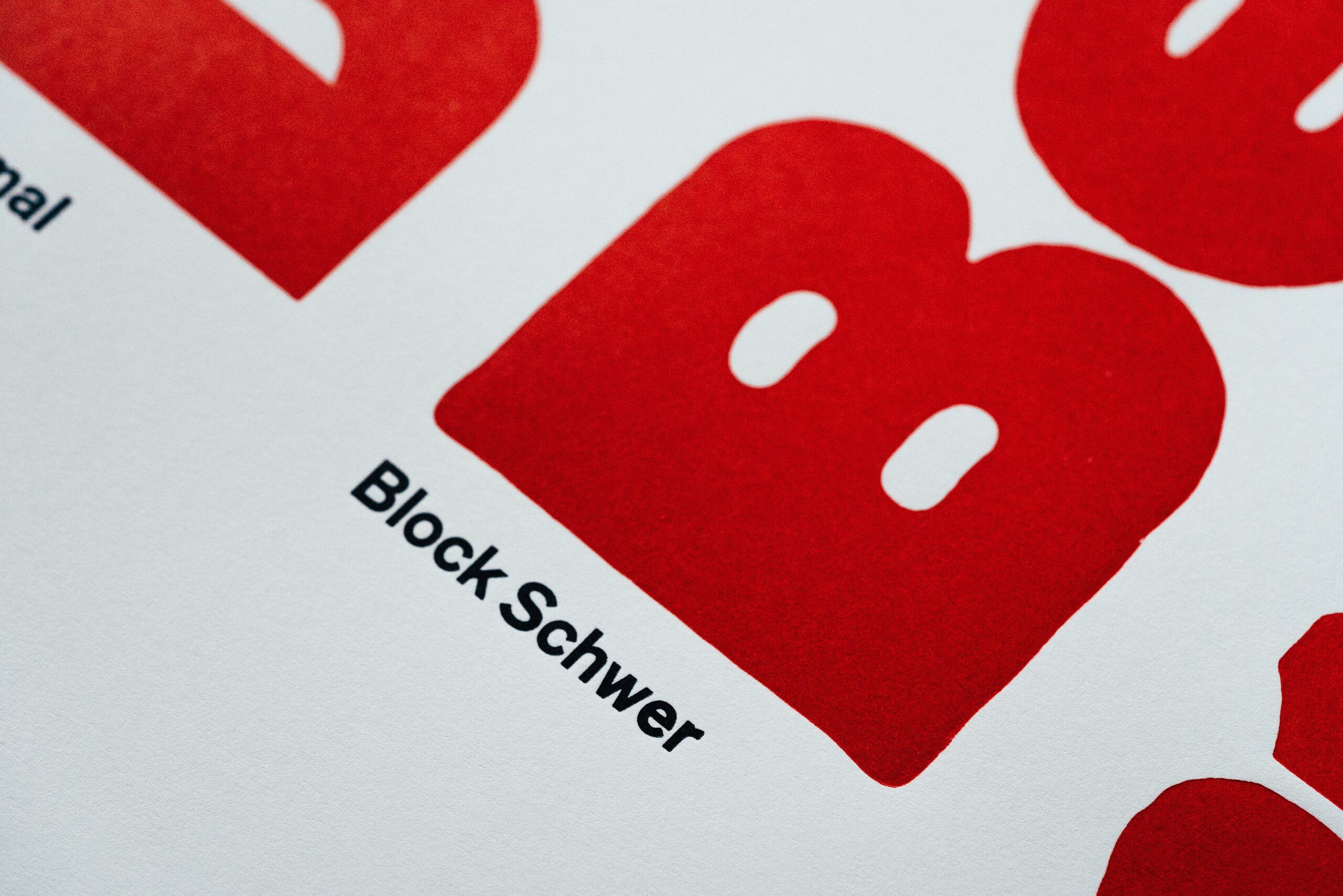
Block’s heavy weight was released in 1922, over a decade after its light, medium and bold counterparts came out, designed by Hermann Hoffmann for the Berthold type foundry (the light weight was in fact drawn by our friend Louis Oppenheim). This type has a strong appearance on the page, can be set quite tightly and cannot be harmed by too much pressure on your German windmill. It comes with multiple alternatives for several letters – a welcome feature for setting justified text (which we very rarely do).
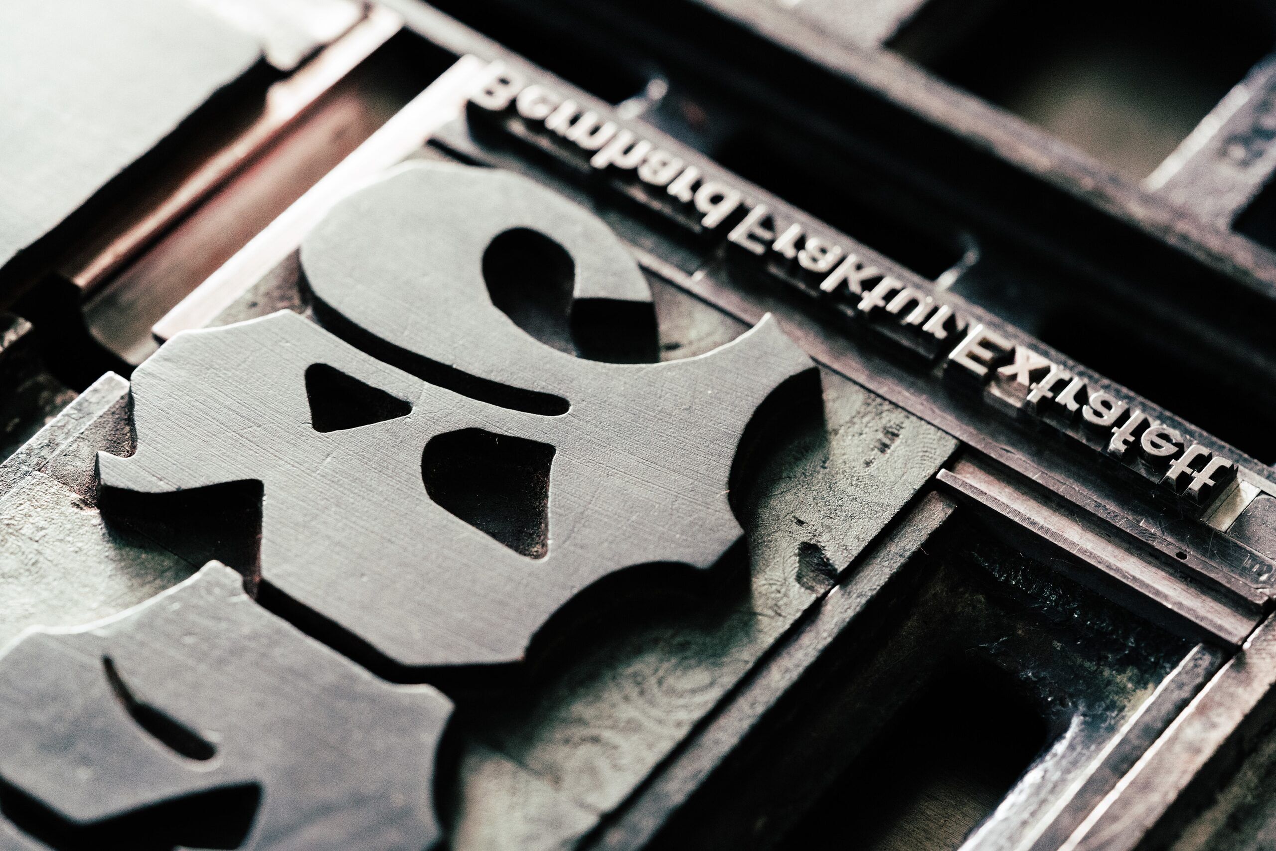
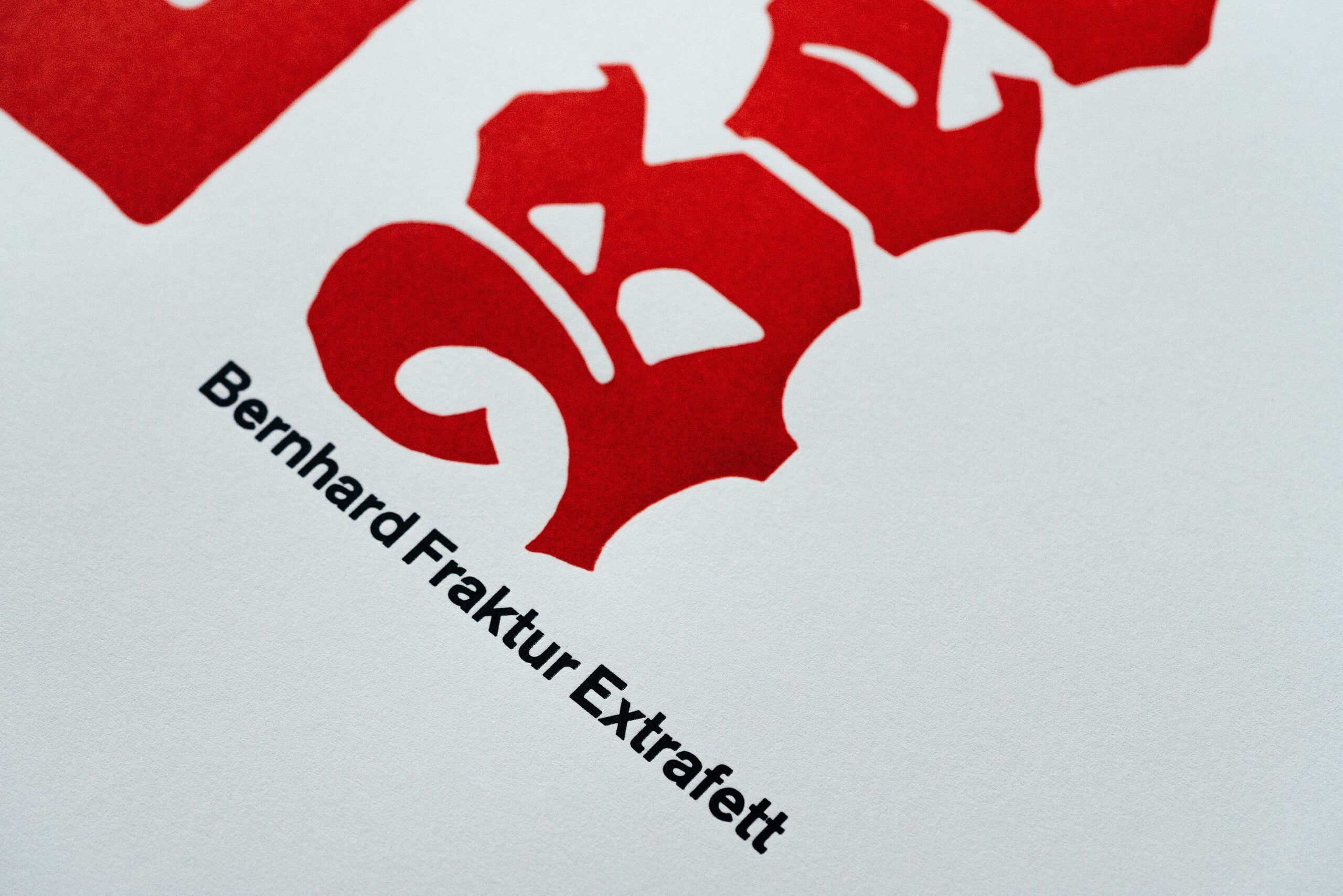
Lucian Bernhard began the large type family that bears his name as early as 1911. Just two years after releasing Bernhard Antiqua, his latin alphabets received a blackletter companion: a narrow light-weight Fraktur with wobbly contours quite suitable for advertising. Not unusual for the metal type days, a second weight as a counterpart only came in 1927. For this Bernhard really brought up the big guns, drawing an extrabold for highest possible contrast to the existing weight. Bernhard Fraktur is a bit of the odd man out, since it was released with the Flinsch type foundry, based in Frankfurt/Main. However, Bernhard also had clients in Berlin and taught there in the early 1920s. Blackletter is obviously a style that cannot be left out of a Berlin poster.
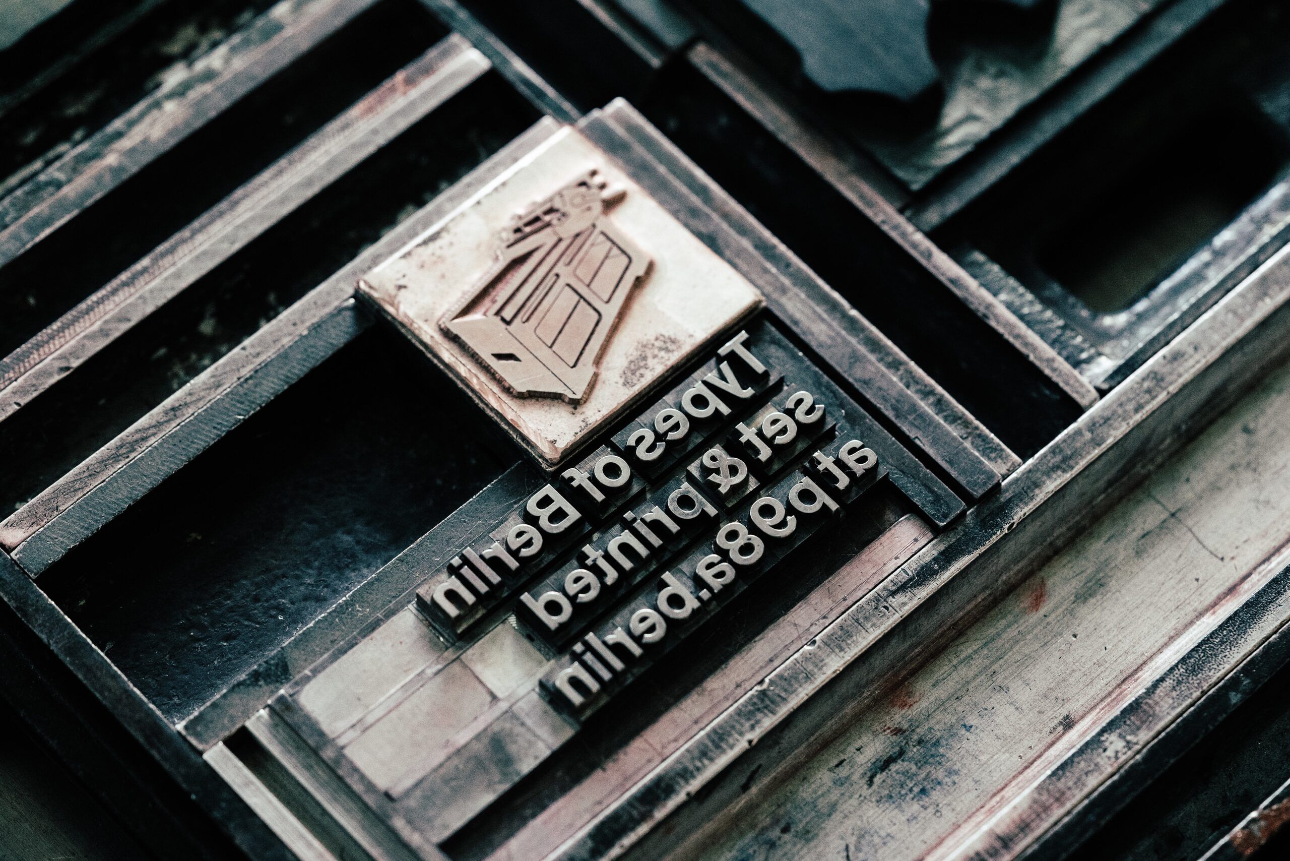
All the decent pictures in this article are shot by our in-house photographer Norman Posselt.